
22 Small Bathroom Paint Colors That Feel So Cozy
Introduction:
Staring at your small bathroom wondering why it feels dull, cramped, or just… unfinished? The right small bathroom paint colors can completely change how a tiny space feels, without knocking down a single wall. This article walks through 22 cozy, inspiring color ideas made specifically for small bathrooms, whether yours has zero windows, an outdated vanity, or simply needs a fresh update. In my experience, most homeowners underestimate just how much paint alone can transform a cramped bathroom into a space that feels warm, intentional, and genuinely enjoyable to use every single day. I’ve noticed the difference often surprises people. Each idea ahead includes a real visual example and practical reasons why it works, so you can pick a shade with confidence instead of guessing.
Soft Sage Green
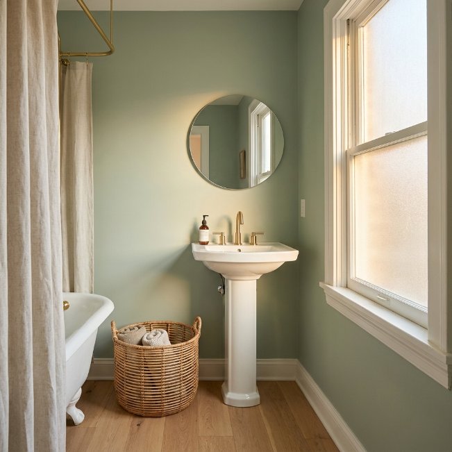
- Brings a calming, spa-like feel to even the tiniest bathroom
- Pairs beautifully with white fixtures and natural wood accents
- Hides small imperfections better than stark white
- Feels fresh without being cold or clinical
- Works well in bathrooms with limited natural light
Soft sage green instantly makes a small bathroom feel like a quiet retreat. This muted, earthy tone sits between green and gray, so it never feels overpowering, even in a tight space. In my experience, sage works especially well in bathrooms with wood vanities or rattan baskets, since the natural textures echo the color’s organic feel. It also photographs beautifully, which is part of why it’s become such a popular choice among small bathroom paint colors on Pinterest boards this year.
Unlike brighter greens, sage doesn’t compete with your fixtures or tile. It sits quietly in the background while still adding personality and warmth to the room. This shade tends to look different throughout the day, leaning slightly gray in the morning and warmer by evening, which keeps the space feeling alive rather than flat. I’ve noticed homeowners who choose sage rarely feel the urge to repaint within a few years, because the color ages gracefully and continues to feel current no matter what trends come and go.
Warm Terracotta Walls
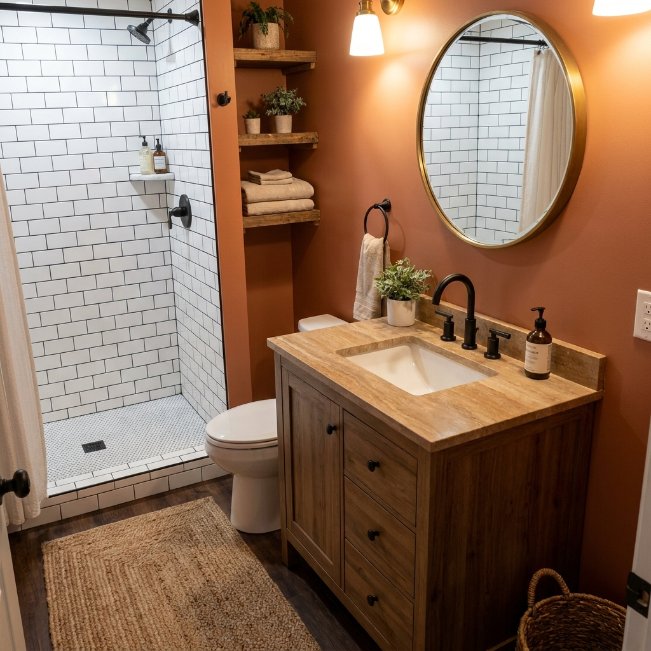
- Adds instant coziness and earthy warmth to small spaces
- Complements black or matte gold fixtures beautifully
- Creates a bold focal point without needing extra decor
- Balances well with white subway tile or plain flooring
- Feels grounded, inviting, and slightly rustic
Warm terracotta is one of those bathroom color choices that instantly makes a small space feel intentional rather than accidental. This clay-inspired tone brings depth and richness, turning a plain bathroom into a warm, styled retreat. It pairs especially well with black hardware, brass fixtures, and natural stone accents. That’s why many designers recommend terracotta for bathrooms lacking architectural detail, since the color itself becomes the design feature, saving you from needing extra decorative elements to make the space feel finished and complete.
Small bathrooms often struggle to feel warm because of all the hard, reflective surfaces like tile and porcelain. Terracotta softens that starkness immediately. It reads as earthy and grounded rather than trendy, which means it won’t feel dated in a few years. I’ve seen this work well in bathrooms with limited windows, since the warm undertones compensate for the lack of golden natural light, creating a cozy glow even under simple overhead lighting or a single vanity fixture.
Moody Charcoal Accent
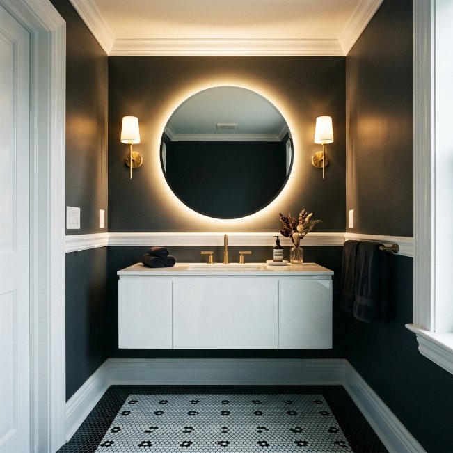
- Creates drama and depth in a compact space
- Makes white fixtures and trim pop beautifully
- Ideal for bathrooms with no natural light
- Adds a modern, boutique-hotel feel instantly
- Works well as a single accent wall if full coverage feels risky
Charcoal might sound like an unusual choice for a small bathroom, but it often works better than expected. Dark walls can make a space feel intentionally cozy rather than cramped, especially when paired with bright white trim, mirrors, or fixtures. This is one of those small bathroom paint colors that surprises people the most once they see it finished. The contrast between deep charcoal and crisp white creates a boutique-hotel feeling that photographs incredibly well and instantly elevates the entire room’s perceived style.
If your bathroom has no windows, charcoal can actually work in your favor rather than against you. Without natural light competing with the tone, the color stays consistent and moody all day, creating a calm, enclosed feeling rather than a dark one. In my experience, adding a single warm-toned light fixture prevents the space from feeling too cave-like. Many homeowners are surprised at how much larger a charcoal bathroom feels once mirrors and proper lighting are added to balance the depth.
Powder Blue Retreat
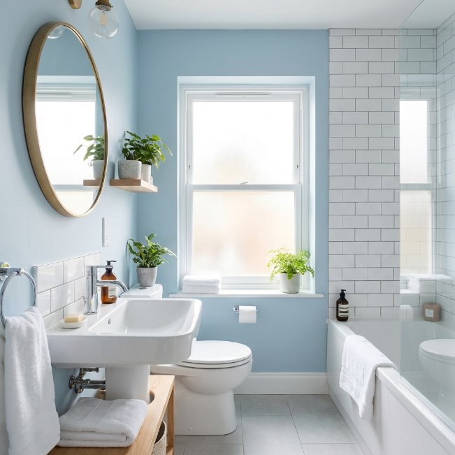
- Brings a calm, airy feeling to tight bathroom layouts
- Pairs perfectly with white or chrome fixtures
- Reflects light well, making the space feel bigger
- Feels fresh, clean, and timeless year-round
- Works beautifully in both modern and classic-style bathrooms
Powder blue remains one of the most requested bathroom color choices, and it’s easy to see why. This soft, muted tone brings a sense of calm the moment you walk in, without feeling cold or sterile. It reflects light beautifully, which makes it especially useful in bathrooms that only get a small amount of sun through a frosted window. Pinterest users consistently save rooms painted in this shade because it feels both nostalgic and current, striking a balance that’s genuinely hard to pull off with most colors.
What makes powder blue so reliable is its flexibility. It works with brass, chrome, matte black, or even wood tones, so you’re not locked into one specific style direction. I’ve noticed that homeowners who choose this shade tend to keep it far longer than trendier colors, simply because it never feels out of place. It also tends to make small bathrooms photograph brighter and larger than they actually are, which matters if you’re hoping to sell your home someday.
Deep Forest Green
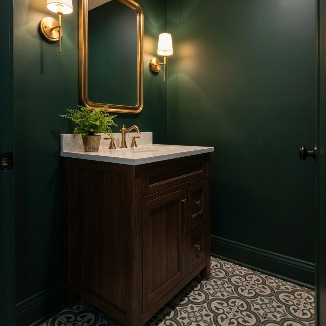
- Adds richness and a nature-inspired feel to small spaces
- Pairs beautifully with brass, gold, or wood accents
- Creates a bold, statement-making look without heavy decor
- Works surprisingly well in bathrooms with minimal natural light
- Feels sophisticated rather than overpowering when balanced with white trim
Deep forest green transforms a small bathroom into something that feels like a private, upscale escape. Unlike lighter greens, this shade leans dramatic, giving the room an established, high-end feel almost instantly. It’s a favorite among bathroom paint colors for people who want their space to feel curated rather than basic. Paired with brass fixtures and a simple white countertop, forest green does most of the styling work on its own, which is ideal for anyone who doesn’t want to spend extra time or money on decor.
Small spaces can actually handle darker, richer tones better than large rooms because there’s less wall space for the color to feel heavy or overwhelming. In my experience, forest green bathrooms feel cozier and more finished than white ones, especially once warm lighting is added. The key is keeping trim, mirrors, or tile bright and simple, so the green has enough contrast to feel intentional. This combination consistently performs well on Pinterest because it looks expensive without requiring an expensive renovation.
Classic Farmhouse White
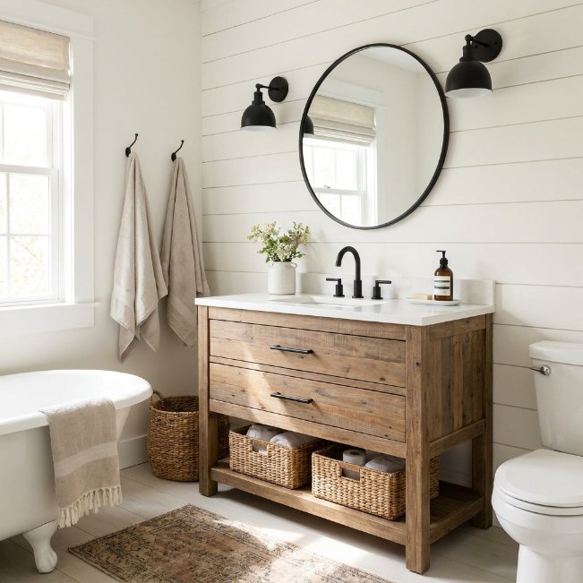
- Keeps small bathrooms feeling bright, open, and timeless
- Works effortlessly with black, brass, or wood accents
- Reflects light well in windowless or low-light bathrooms
- Easy to update with towels, rugs, or small decor
- A safe, versatile choice for resale-ready homes
Classic farmhouse white continues to be one of the most searched small bathroom paint color ideas, and for good reason. It’s forgiving, timeless, and instantly brightens a space that might otherwise feel closed in. This isn’t a stark, clinical white, but a soft, warm-toned version that feels inviting rather than sterile. It’s especially useful in bathrooms with no windows, since it bounces whatever light is available around the room, making the space feel noticeably more open than its actual square footage suggests.
The real advantage of farmhouse white is how easily it adapts to different styles over time. I’ve seen this work well for homeowners who like to switch out towels, rugs, and hardware seasonally, since the walls act as a blank, flexible canvas. That’s why many designers recommend this shade for anyone preparing to sell, as it appeals to the widest range of buyers. Paired with black fixtures or natural wood, it also photographs beautifully for listings and Pinterest boards alike.
Blush Pink Charm
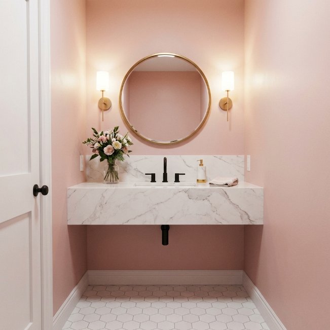
- Softens small bathrooms with a warm, welcoming glow
- Pairs beautifully with brass, gold, or matte black fixtures
- Feels playful without being overly bright or juvenile
- Works well as either a full wall or half-wall accent
- Adds personality to guest bathrooms and powder rooms
Blush pink has quietly become one of the most saved bathroom color trends on Pinterest, and it’s easy to understand the appeal. This muted, dusty version of pink feels sophisticated rather than sweet, especially when paired with black or brass hardware. It’s a shade that works particularly well in small guest bathrooms or powder rooms, where you want a little personality without committing to something too bold for daily use. The warmth of blush also tends to flatter skin tones, which is a small but noticeable perk homeowners often mention after painting.
What surprises most people is how versatile blush pink actually is. It leans neutral enough to work in both modern and traditional bathrooms, yet it still feels distinct from typical beige or gray. I’ve noticed that pairing it with white marble-look tile keeps the look feeling fresh rather than dated, since the contrast prevents the pink from feeling too sugary. This combination consistently ranks among the more clicked small bathroom paint color ideas on design boards.
Rich Navy Statement
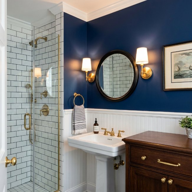
- Delivers bold contrast in a compact bathroom footprint
- Pairs beautifully with white, brass, or natural wood
- Creates a nautical or classic feel depending on styling
- Ideal for bathrooms wanting a dramatic, non-neutral look
- Hides water spots and daily wear better than lighter shades
Rich navy is proof that dark colors can genuinely work wonders in small bathrooms, despite the common myth that dark paint always shrinks a space. This deep, saturated blue adds instant sophistication, especially when balanced with crisp white trim or a bright vanity. It’s one of the more requested bathroom paint colors among homeowners wanting something that feels classic rather than trendy. Navy also has a practical upside: it hides everyday marks, water splashes, and minor scuffs far better than pale colors, which matters in a room that gets used constantly.
I’ve tried navy in bathrooms with both plenty of light and almost none, and it holds up beautifully either way. In brighter spaces, it feels crisp and nautical, especially with white subway tile. In darker bathrooms, it leans moody and elegant, particularly with warm brass fixtures. The key to making navy work in a small space is keeping the ceiling and trim white, which prevents the room from feeling boxed in while still letting the color shine.
Warm Greige Balance
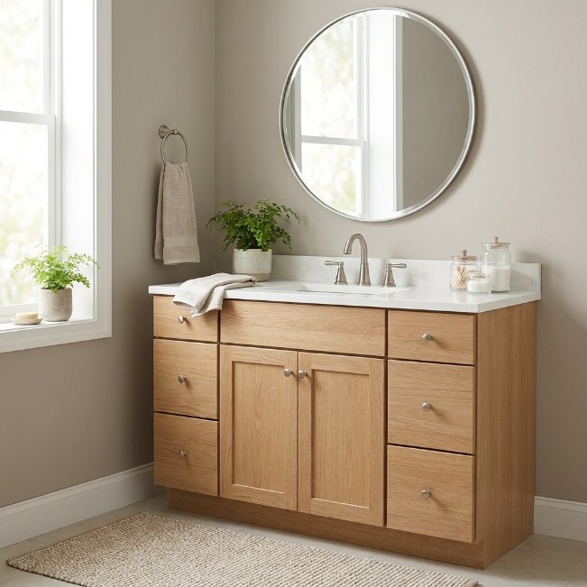
- Offers a soft, neutral base that never feels boring
- Works with nearly any fixture finish or decor style
- Brightens small bathrooms without feeling stark or cold
- A safe, resale-friendly choice that still feels current
- Easy to accessorize with seasonal colors and textures
Warm greige continues to dominate searches for the best paint color for a small bathroom, and it’s not hard to see why. This blend of gray and beige gives you the calming neutrality of gray without the coldness that sometimes comes with it. It’s an especially smart choice for bathrooms that need to feel larger and brighter, since greige reflects light softly rather than absorbing it. Unlike stark white, it also hides small imperfections in older walls, which makes it a practical pick for homes with plaster or textured surfaces.
That’s why many designers recommend greige as a starting point for anyone unsure about committing to a bolder color. It acts almost like a blank canvas, letting your towels, rugs, and hardware do the personality work instead. I’ve seen this work well in bathrooms that get updated seasonally, since greige pairs effortlessly with warm autumn tones or cool spring accents. It’s a low-risk, high-reward choice for anyone who wants their small bathroom to feel finished without a major commitment.
Buttery Soft Yellow
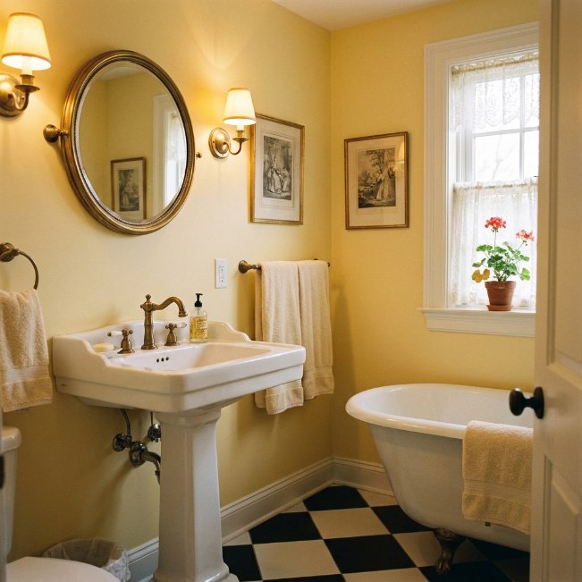
- Adds a cheerful, sunny feel to bathrooms with little natural light
- Pairs beautifully with white tile and brass fixtures
- Feels nostalgic without looking dated when kept muted
- Brightens the room even on cloudy days
- Works especially well in cottage or vintage-style bathrooms
Buttery soft yellow is one of those small bathroom paint colors that instantly lifts the mood of a space. Unlike bright, saturated yellows, this muted version feels warm and gentle rather than overwhelming. It’s a particularly smart choice for bathrooms with no windows, since the color itself mimics the glow of natural sunlight, tricking the eye into feeling brighter than the room actually is. Paired with white fixtures and simple brass hardware, it creates a cheerful, cottage-inspired look that feels fresh every time you walk in, morning or night.
I’ve noticed that soft yellow works best when kept slightly muted rather than bold, since a true bright yellow can feel harsh under artificial bathroom lighting. Adding warm-toned bulbs enhances the coziness even further, giving the room a soft, golden glow year-round. This shade also pairs surprisingly well with black and white checkered flooring, which has become a popular combination on Pinterest for anyone wanting a playful, retro-inspired bathroom without a full renovation.
Deep Plum Accent
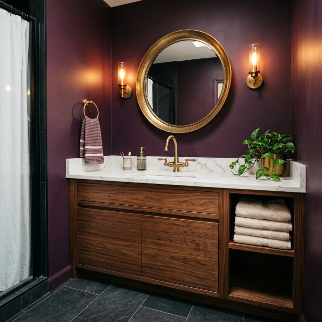
- Brings unexpected richness and warmth to compact spaces
- Pairs well with brass, matte black, or warm wood tones
- Feels luxurious without requiring expensive materials
- Ideal for bathrooms wanting a unique, non-traditional color
- Works well as a full room color or bold accent wall
Deep plum is quickly becoming a favorite among bold bathroom color choices, especially for homeowners tired of the usual gray-and-white combination. This rich, wine-inspired tone feels luxurious and unexpected, turning an ordinary small bathroom into something that looks intentionally designed. It sits somewhere between purple and burgundy, which gives it enough depth to feel dramatic without veering into overly feminine territory. Paired with brass fixtures and warm lighting, plum creates a jewel-toned retreat that photographs beautifully and stands out immediately on any Pinterest board.
In my experience, plum works particularly well in bathrooms used mostly in the evening, since the color deepens and glows under warm artificial light. It also pairs nicely with natural materials like wood and stone, which soften the boldness and keep the space feeling grounded rather than overly dramatic. For anyone hesitant about a full room in plum, painting just the vanity or a single accent wall offers the same richness with a smaller commitment.
Crisp Mint Freshness
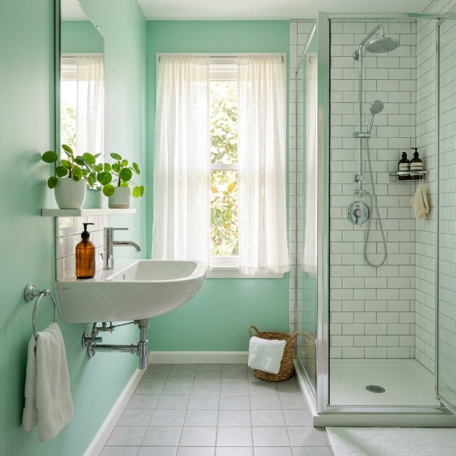
- Adds a light, spa-inspired energy to small bathrooms
- Pairs beautifully with white subway tile and chrome fixtures
- Feels clean and refreshing without being cold
- Works especially well in bathrooms with plenty of natural light
- A playful yet timeless option for kids’ or guest bathrooms
Crisp mint brings a refreshing, spa-like energy that’s hard to replicate with any other color. It sits comfortably between blue and green, giving it a cool, clean feel that works beautifully in bathrooms that get a decent amount of daylight. This shade has remained a steady favorite among bathroom paint colors for guest and kids’ bathrooms, since it feels playful without being too juvenile for adult use. Paired with white subway tile and simple chrome fixtures, mint creates a bright, airy space that feels larger and more energized than its actual size.
I’ve seen this work well in bathrooms that double as a guest space, since mint tends to appeal to a wide range of ages and tastes. It photographs especially well in natural light, which makes it a strong choice if you’re documenting a renovation for Pinterest or social media. Unlike more saturated greens, mint stays light and breathable, keeping the small footprint of the room from ever feeling closed in or heavy.
Warm Taupe Neutral
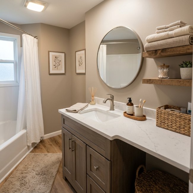
- Creates a cozy, grounded feel without leaning too dark
- Works with nearly every fixture finish and material
- Hides everyday wear better than bright white
- Feels timeless and won’t compete with future decor changes
- A dependable choice for bathrooms used by the whole family
Warm taupe is a quiet favorite among small bathroom paint colors because it does everything well without demanding attention. It’s warmer than gray, softer than brown, and flexible enough to pair with almost any hardware finish, from brushed nickel to matte black. This makes it a smart pick for busy family bathrooms, where the color needs to look good regardless of what towels or bath toys happen to be out. Taupe also does an excellent job of hiding water spots, toothpaste splatters, and general daily wear, which is a genuinely underrated practical benefit.
That’s why many designers recommend taupe for bathrooms that get heavy daily use, since it stays looking clean and fresh longer than lighter shades. I’ve noticed it also photographs well under almost any lighting condition, whether that’s harsh overhead bulbs or soft natural daylight. For anyone who wants a bathroom that feels updated without needing to be repainted every few years, taupe offers one of the best returns on a relatively low-effort paint update.
Dusty Lavender Glow
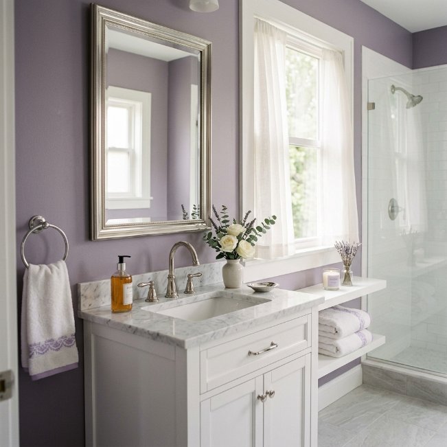
- Softens small bathrooms with a gentle, calming presence
- Pairs beautifully with white, silver, or soft gold accents
- Feels romantic without being overly bold or bright
- Works especially well in bathrooms used mostly by adults
- Adds a subtle pop of color without overwhelming the space
Dusty lavender offers a gentler way to bring purple into a small bathroom without it feeling overpowering. This muted, grayed-down shade reads as sophisticated rather than childish, making it a fitting choice among small bathroom paint color ideas for adult primary bathrooms or elegant guest spaces. It has a way of catching the light softly throughout the day, shifting from a cool gray-purple in the morning to a warmer, rosier tone by evening. That subtle shift keeps the room feeling dynamic rather than flat or one-dimensional.
I’ve tried this shade in bathrooms with soft white or silver fixtures, and the pairing feels calm and put together every time. Lavender also works surprisingly well with warm gold accents if you want a slightly richer, more romantic feel instead of a cooler one. Because the tone is so muted, it rarely clashes with existing tile or flooring, which makes it a low-risk way to introduce color into a bathroom that’s otherwise fairly neutral.
Bold Black Vanity Wall
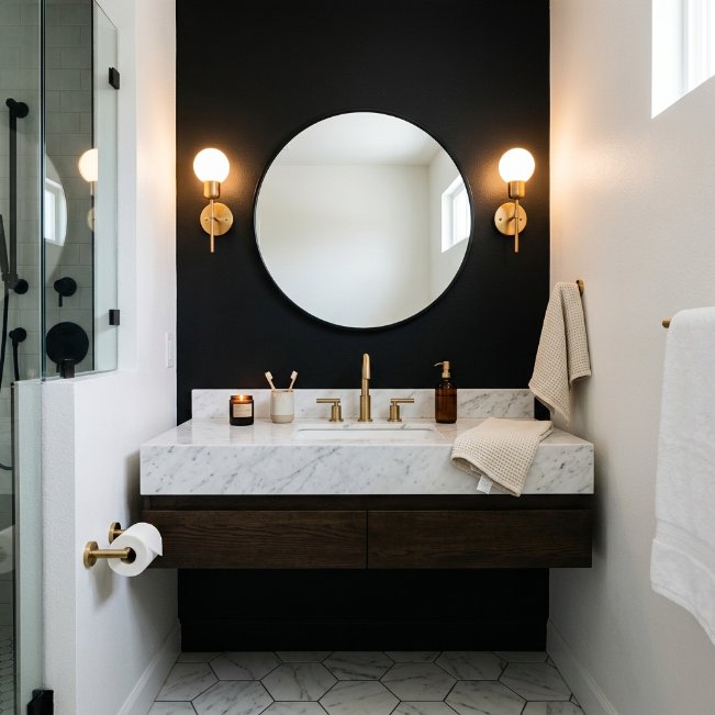
- Adds instant drama and a modern, high-end feel
- Pairs beautifully with white walls, brass, or marble accents
- Makes small bathrooms feel curated rather than plain
- Works well as a focal accent behind a black vanity
- A striking option for anyone wanting a boutique-style look
A black vanity wall is one of the boldest small bathroom paint colors trends right now, and it delivers serious visual impact for very little effort. Rather than painting the entire room black, this approach focuses the color on a single wall behind the vanity, creating a dramatic focal point without making the space feel smaller. Paired with a white or marble countertop and brass fixtures, the contrast feels polished and intentional, almost like something out of a boutique hotel. It’s a favorite among Pinterest users specifically because it looks expensive but costs little more than a can of paint.
In my experience, this idea works best when the rest of the bathroom stays bright and simple, letting the black wall do the heavy lifting stylistically. Adding a black-framed mirror on top of the black wall creates a striking, almost sculptural look that photographs beautifully. This is a great option for renters or anyone hesitant to commit to a full room color, since a single accent wall can always be painted over easily later.
Soft Sky Blue-Gray
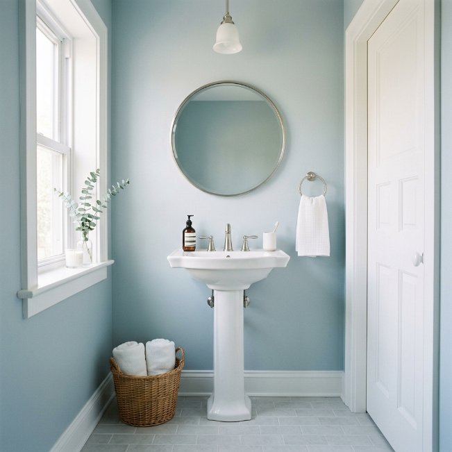
- Balances calm and brightness in tight bathroom layouts
- Works beautifully with white trim and chrome or nickel fixtures
- Feels crisp and clean without leaning cold or clinical
- Reflects available light well in low-window bathrooms
- A dependable, versatile pick that suits most home styles
Soft sky blue-gray sits right in that sweet spot between blue and gray, which is exactly why it shows up so often in searches for the best paint color for a small bathroom. It has enough blue to feel calming and fresh, but enough gray to keep it grounded and easy to pair with existing fixtures. This shade is particularly forgiving in bathrooms with limited daylight, since it doesn’t shift into looking dull or flat the way some pure blues can under artificial lighting.
I’ve noticed this color performs consistently well across different bathroom styles, from modern to traditional, which makes it a safer choice for anyone who isn’t ready to commit to something bolder. It pairs nicely with both warm and cool-toned metals, so you’re not restricted to one hardware finish. Small bathrooms painted in this tone tend to photograph brighter than they actually are, which is part of why it remains such a popular, steady choice on Pinterest boards.
Rich Chocolate Brown
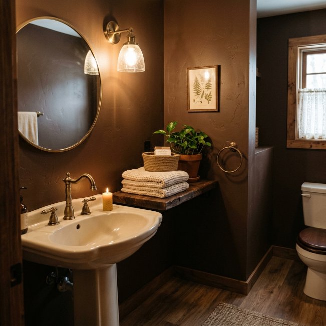
- Adds warmth and depth without feeling heavy or dark
- Pairs beautifully with cream, white, or brass accents
- Creates a cozy, cabin-like feel in small spaces
- Hides daily marks and water spots exceptionally well
- Works especially well with wood vanities and natural textures
Rich chocolate brown has been quietly gaining popularity as one of the more unexpected bathroom paint colors for anyone wanting warmth over the usual cool neutrals. This deep, earthy shade brings a cabin-like coziness to a small bathroom, especially when paired with wood accents and simple white or cream fixtures. It reads as sophisticated rather than dated, particularly when balanced with brass hardware and soft, warm lighting throughout the space.
That’s why many designers recommend deep brown tones for bathrooms that see heavy daily traffic, since the color hides water spots, fingerprints, and general wear far better than lighter shades ever could. I’ve seen this work especially well in bathrooms with wood-look flooring, since the tones blend seamlessly rather than competing with each other. For anyone worried that brown might feel outdated, pairing it with clean white trim and modern brass fixtures keeps the overall look current and intentional rather than old-fashioned.
Pale Peach Warmth
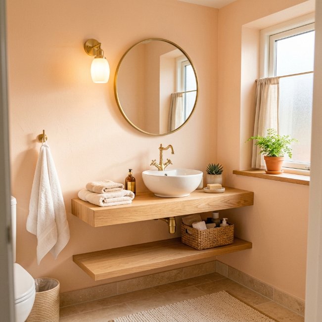
- Brings a soft, sunlit glow to bathrooms lacking natural light
- Pairs well with white, brass, or warm wood tones
- Feels fresh and inviting without being overly sweet
- Flatters skin tones under vanity lighting
- A gentle way to add color without overwhelming a small space
Pale peach offers a subtle, sunlit warmth that works especially well in bathrooms that don’t get much natural daylight. This soft, muted tone mimics the glow of golden hour, making even a windowless bathroom feel bright and cheerful throughout the day. It’s become a popular pick among small bathroom paint color ideas for anyone wanting a hint of color without committing to something bold or saturated. Paired with white fixtures and brass hardware, peach creates a warm, welcoming space that feels genuinely different from the typical white or gray bathroom.
In my experience, pale peach is one of the more flattering wall colors you can choose near a mirror, since the warm undertone softens harsh vanity lighting in a way that most neutrals simply can’t. It also pairs beautifully with warm wood accents, creating a cohesive, sunlit feel even in the middle of winter. This makes it a smart choice for anyone wanting their small bathroom to feel consistently warm and inviting, regardless of the season or time of day.
Cool Slate Gray
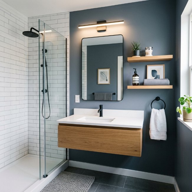
- Delivers a sleek, modern edge to compact bathrooms
- Pairs beautifully with white tile, chrome, or matte black
- Feels sophisticated without turning cold or sterile
- Works well in bathrooms with ample natural or LED lighting
- A strong choice for minimalist or contemporary-style homes
Cool slate gray brings a polished, modern edge to small bathrooms that other neutrals sometimes struggle to achieve. This deeper, blue-toned gray reads as intentional and design-forward, especially when paired with crisp white tile and either chrome or matte black fixtures. It’s a frequent search among bathroom paint colors for homeowners chasing a minimalist, spa-like aesthetic without going fully monochrome. Because it has cooler undertones, slate gray photographs especially well under bright LED lighting, which makes it a strong choice for bathrooms that rely heavily on artificial light rather than sunlight.
I’ve noticed slate gray works best when the room includes at least one warm element, like a wood shelf or brass accent, to keep the space from feeling too clinical. Without that contrast, an all-gray-and-white bathroom can start to feel a bit sterile. Adding texture through towels, a woven mat, or greenery softens the coolness while keeping the sleek, modern look fully intact and true to the intended aesthetic.
Warm Camel Tan
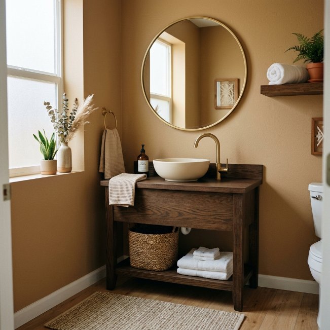
- Adds a soft, sun-warmed neutral without feeling flat
- Pairs beautifully with cream, white, or dark wood accents
- Feels grounded and cozy in bathrooms of any size
- Hides scuffs and daily wear better than pale neutrals
- A versatile base for both modern and traditional styles
Warm camel tan bridges the gap between beige and brown, giving small bathrooms a sun-warmed neutral that never feels flat or boring. It’s a shade that consistently ranks among the best paint colors for small bathrooms because it adapts so easily to different fixture finishes, from brushed gold to matte black. Camel has just enough depth to add visual interest to plain walls, while still staying light enough to keep a compact bathroom from feeling closed in or heavy.
That’s why many designers recommend warm neutrals like camel for bathrooms without a lot of architectural detail, since the color itself adds warmth and dimension that plain white or beige simply can’t match. I’ve seen this tone paired successfully with both traditional wood vanities and sleeker modern fixtures, which speaks to how flexible it really is. It also tends to hide everyday scuffs and water marks better than paler shades, making it a practical option for busy households.
Soft White Vanity Contrast
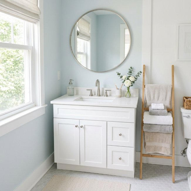
- Keeps small bathrooms bright while adding subtle definition
- Pairs a crisp white vanity against a lightly colored wall
- Creates visual contrast without darkening the overall space
- Works well in bathrooms wanting brightness plus a hint of personality
- A flexible option for renters or frequent style changes
Pairing a soft white vanity against a gently colored wall is a simple way to add personality to a small bathroom without sacrificing brightness. This approach works particularly well for anyone who loves the idea of color but is nervous about committing to a fully painted room. The white vanity keeps the space feeling open and airy, while the wall color, whether that’s a pale blue, soft green, or muted pink, adds just enough interest to keep the room from feeling plain or unfinished.
In my experience, this contrast method is one of the easiest ways to update a bathroom without a full renovation, since only the walls need attention if the vanity is already white. It also gives renters or frequent redecorators an easy way to change the room’s mood simply by repainting the walls down the line. This flexible pairing consistently performs well among small bathroom paint color ideas because it balances brightness with just enough personality to feel styled.
Creamy Vanilla Neutral
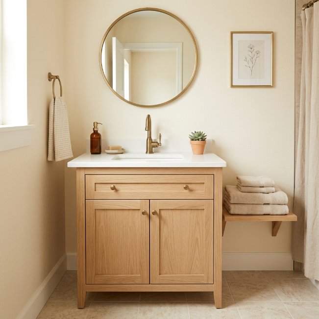
- Keeps small bathrooms feeling soft, bright, and welcoming
- Pairs effortlessly with wood, brass, or white accents
- Feels warmer and cozier than a stark white
- Works well in nearly any lighting condition
- A timeless finishing choice for a cohesive, calm space
Creamy vanilla is a gentle step away from stark white, offering small bathrooms a softer, warmer neutral that still keeps the room feeling bright and open. It’s one of those small bathroom paint colors that quietly does everything right without ever feeling boring or overly plain. Unlike cooler whites, vanilla has just enough warmth to prevent a bathroom from feeling clinical, especially under everyday lighting. It pairs effortlessly with wood vanities, brass fixtures, or even simple white trim, making it one of the easiest neutrals to build a cohesive look around.
I’ve noticed this shade works particularly well for anyone finishing a renovation and wanting the walls to feel intentional without competing with tile, flooring, or fixtures already in place. It photographs softly and consistently, regardless of the time of day, which makes it a reliable choice for both real listings and Pinterest inspiration boards. For a small bathroom that needs to feel calm, cohesive, and effortlessly put together, creamy vanilla remains one of the safest and most satisfying choices available.
Conclusion:
A small bathroom doesn’t need more space to feel special, it just needs the right color. From cozy terracotta to calming sage and moody charcoal, these small bathroom paint colors prove that even the tiniest room can feel warm, styled, and completely transformed with a single can of paint. I’ve seen how small changes like these can completely change the way a space feels to live in every day. Save this post to your Pinterest board, try one of these shades in your own bathroom, and share it with anyone who could use a little color inspiration for their next refresh.