
22 Chic Dining Room Wall Decor Ideas for Every Style
Introduction:
Staring at a blank dining room wall and not sure where to start? You’re not alone. It’s one of the most overlooked spaces in the home, yet it has the power to completely change how a room feels. This collection of dining room wall decor ideas is here to fix that, offering fresh, practical inspiration for every style, from cozy farmhouse to sleek modern minimalism.
In my experience, the dining room often gets styled last, long after the living room and bedroom are finished. But it’s usually where families gather most, making it worth just as much thoughtful attention. Whether you’re working with a small apartment nook or a full formal dining room, these 22 ideas are designed to be simple, achievable, and genuinely transformative. Scroll through, save your favorites, and get ready to see your dining wall in a whole new way.
Gallery Wall Layout

- Turns one blank wall into the room’s main focal point
- Mixes frame sizes and styles for a curated, collected-over-time look
- Works with almost any furniture style already in the room
- Adds personality without needing a full room redesign
- Great option for renters since frames can move with you
A gallery wall instantly makes an empty dining space feel intentional and finished. Instead of one large piece, you layer several smaller frames, mirrors, or prints together, creating movement and depth on the wall. This approach is especially useful for dining room wall decor because it fills vertical space without overwhelming the table below it. In my experience, mixing at least one mirror into the layout helps bounce light around the room, making it feel brighter and slightly larger, even in smaller dining areas with limited natural light.
Choosing a mix of textures keeps the wall from feeling flat or repetitive. Combine framed photography, abstract prints, and one textured piece like woven wall art for visual contrast. I’ve noticed homeowners often stick to one theme, like botanical prints or black-and-white photography, which keeps the gallery cohesive even with different frame sizes. Leave two to three inches between each piece for a balanced, gallery-style spacing. This layout works beautifully whether your dining area is open-concept or a separate, enclosed room.
Statement Mirror

- Reflects light to make the dining space feel brighter and bigger
- Serves as an easy, low-effort focal point
- Pairs well with both modern and traditional furniture
- Requires zero maintenance compared to art that can fade
A single oversized mirror can do more visual work than several small frames combined. Placed above a buffet, console, or directly on the main wall, it reflects light from windows or fixtures, making the whole dining area feel more open. This is one of the simplest dining room wall decor ideas because it requires just one purchase and one hanging point. That’s why many designers recommend starting here if you’re unsure where else to begin, since a mirror rarely clashes with existing furniture or color schemes already in the room.
Shape and frame choice change the entire feel of the space. A round mirror softens a room full of straight lines and rectangular tables, while an arched or rectangular mirror suits more traditional dining rooms with symmetrical layouts. Thin metal frames feel modern, while wood-carved frames lean classic and warm. I’ve seen this work well in narrow dining rooms especially, where a tall mirror visually stretches the ceiling height and makes the whole space feel less cramped without moving a single piece of furniture.
Woven Wall Baskets
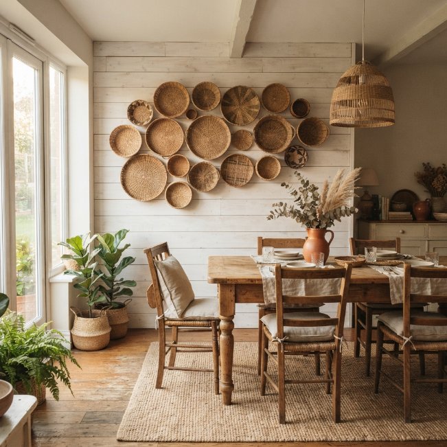
- Brings texture and warmth without using paint or color
- Adds a boho or farmhouse feel instantly
- Budget-friendly compared to framed art or large mirrors
- Lightweight and easy to hang on most wall types
Woven baskets bring texture into a dining room in a way flat art simply can’t. Arranged in a cluster of varying sizes, they add dimension and a handmade, earthy feel to plain walls. This idea works particularly well as dining area decor in homes leaning boho, coastal, or farmhouse, where natural materials already play a big role in the overall design. Unlike framed prints, baskets catch shadows differently throughout the day, giving the wall a subtle, ever-changing visual texture that feels organic rather than static or overly styled.
Start with three to five baskets of different diameters for the most natural-looking arrangement. Place the largest basket slightly off-center, then build outward with smaller ones in a loose, asymmetrical cluster. In my experience, uneven spacing looks far more authentic than a perfectly gridded layout, since baskets are meant to feel collected rather than precisely measured. This idea pairs beautifully with wooden furniture, linen table runners, and warm lighting, tying the whole dining space together with cohesive, natural textures throughout.
Framed Botanical Prints

- Brings a fresh, calming feel without using real plants
- Works in almost any color scheme with white or cream backgrounds
- Easy to source affordably or even print at home
- Creates a cohesive, gallery-like look with minimal effort
Botanical prints are one of the easiest ways to bring the outdoors into a dining space. A row of matching leaf, floral, or plant illustrations creates a clean, structured look that still feels soft and inviting. This kind of wall decor for dining room spaces works especially well in bright, airy rooms where natural light is already part of the design. Odd numbers, like three or five prints, tend to create better visual balance than even sets, giving the wall a rhythm that feels intentional rather than randomly placed.
Framing matters just as much as the print itself. Thin black or wood frames keep the focus on the artwork, while white mats add breathing room around each print. I’ve noticed that spacing prints two to three inches apart, and aligning them at the same height, gives the wall a polished, gallery-quality finish. This idea suits nearly every style, from modern minimalist to cottagecore, and pairs effortlessly with wooden furniture, linen textiles, and greenery already placed around the dining room.
Plate Wall Display

- Adds color and pattern without painting the walls
- Great way to display inherited or collected china
- Creates a charming, vintage-inspired focal point
- Works especially well in farmhouse or cottage-style rooms
A plate wall turns everyday dinnerware into striking dining room artwork. Mixing patterns, sizes, and colors of vintage or thrifted plates creates a display that feels personal and collected rather than store-bought. This idea has stayed popular because it doubles as storage for special-occasion china while keeping it visible and appreciated instead of hidden in a cabinet. It works particularly well above a hutch, buffet, or sideboard, where the display feels connected to the furniture below it rather than floating awkwardly on its own.
Plate hangers make installation simple, even on plaster or drywall. Arrange the largest plates first, spacing them in a loose circular or oval pattern, then fill gaps with smaller plates for balance. That’s why many designers recommend starting with an odd number of plates, since it naturally avoids a too-symmetrical, stiff appearance. This dining room decor idea works beautifully in cottage, farmhouse, or eclectic-style homes, adding warmth, color, and a sense of history to the wall.
Oversized Canvas Art

- Fills large wall space with minimal visual clutter
- Creates an instant focal point without multiple pieces
- Easier to coordinate with existing color palettes
- Adds a gallery or boutique-hotel feel to the room
One oversized canvas can carry an entire wall on its own. Instead of clustering several smaller frames, a single large piece keeps the design clean and modern while still making a strong visual statement. This approach to dining room wall art works especially well in open-concept homes, where the dining area flows into the kitchen or living room, since a bold canvas naturally separates the space without adding a physical divider or extra furniture. It’s a favorite among minimalist and contemporary-style homeowners for exactly this reason.
Scale matters more than anything else with this idea. The canvas should cover roughly two-thirds of the wall width above the table for proper proportion. I’ve tried this in narrow dining rooms and found that abstract art with muted, warm tones works better than busy patterns, since it adds interest without competing with the table setting. Choose colors that echo something already in the room, like a rug or chair fabric, to tie the whole space together naturally.
Wood Panel Accent
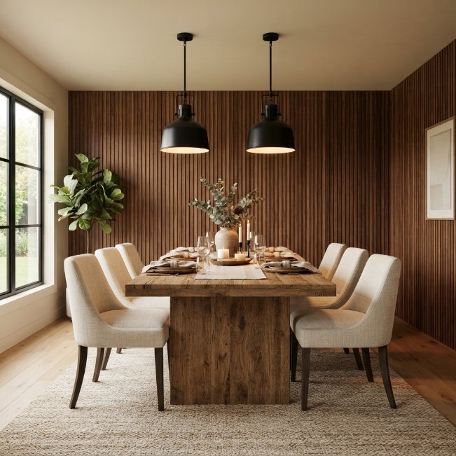
- Adds texture and warmth without hanging any art
- Creates a built-in, custom-designed feel
- Works as a striking backdrop for a table or buffet
- Hides minor wall imperfections better than flat paint
Wood paneling turns a plain wall into a textured, architectural feature. Vertical slats installed floor-to-ceiling, or as a partial accent behind the table, add depth and warmth that flat paint simply can’t match. This idea works as both dining room decor and a functional upgrade, since paneling also helps absorb sound in rooms with hard flooring and minimal soft furnishings. Walnut or oak tones bring a natural warmth, while whitewashed panels suit brighter, more coastal-inspired spaces without feeling heavy or overly rustic.
Installation is more approachable than most homeowners expect, with pre-cut slat panels now widely available for DIY projects. I’ve noticed that pairing wood paneling with matte black or brass fixtures creates a striking contrast that photographs beautifully, which explains why this look spreads so quickly on Pinterest boards. Keep the rest of the wall decor minimal here, since the paneling itself is the statement. A single pendant light or small shelf is usually all the extra styling this wall needs.
Floating Shelf Styling

- Combines decor with light, practical storage
- Easy to restyle seasonally without repainting or rehanging art
- Adds height and dimension to an empty wall
- Works well in small dining areas needing extra surface space
Floating shelves offer flexibility that framed art simply can’t provide. Styled with small vases, candles, books, or a trailing plant, they create a curated look that can change with the seasons or your mood. This idea is especially useful as dining area artwork alternatives for renters or anyone who prefers not to drill multiple holes for a full gallery wall. Two shelves, staggered at slightly different heights, create visual interest while keeping the overall look light and uncluttered rather than heavy or overly styled.
Styling shelves well comes down to restraint. In my experience, three to five objects per shelf, varied in height and grouped in odd numbers, looks far more polished than a fully packed shelf. Leave visible negative space between groupings so the eye has somewhere to rest. This idea suits Scandinavian, modern, and transitional dining rooms particularly well, since the clean lines of floating shelves complement simple furniture without introducing extra visual clutter to an already functional space.
Bold Wallpaper Accent
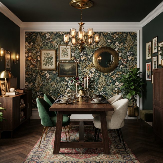
- Adds pattern and color without needing extra artwork
- Creates drama and personality in smaller dining spaces
- Removable options make it renter-friendly
- Pairs beautifully with simple, uncluttered furniture
Wallpaper remains one of the boldest ways to transform a dining room wall. A single accent wall, whether botanical, geometric, or richly colored, gives the room instant personality without requiring any additional wall decorations for dining room spaces. This works especially well in smaller dining areas, where one striking wall creates impact without overwhelming the whole room the way wallpapering every surface might. Peel-and-stick versions have made this option far more accessible, since they remove easily without damaging walls underneath.
Choosing where to apply wallpaper changes its effect entirely. Behind a buffet or on the wall facing the entryway tends to create the strongest visual impact, since it’s the first thing guests notice when entering the space. I’ve seen this work well in dining rooms with otherwise plain, builder-grade finishes, instantly making the space feel custom-designed. Keep furniture and other decor simple when using bold wallpaper, letting the pattern remain the clear focal point of the room.
Sculptural Wall Art
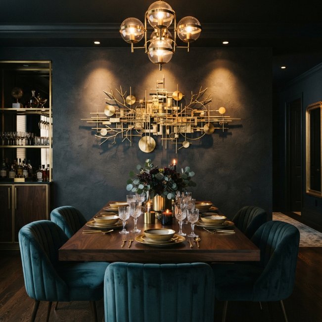
- Adds depth and shadow play that flat art can’t achieve
- Creates a high-end, boutique feel with one statement piece
- Casts interesting shadows as lighting changes throughout the day
- Works as a striking focal point in darker, dramatic rooms
Sculptural wall art brings dimension into a space that flat prints or canvases simply can’t replicate. Made from metal, wood, or resin, these three-dimensional pieces catch light differently throughout the day, casting subtle shadows that shift the mood of the room. This kind of dining room wall art works particularly well in rooms with darker paint colors or moody lighting, since the texture and shadow add richness that would otherwise get lost against a plain wall. It’s a favorite choice for anyone wanting a boutique-hotel feel at home.
Metallic finishes like brass, gold, or bronze pair beautifully with warm lighting and deep wall colors, creating a glamorous, layered look. I’ve noticed that one large sculptural piece almost always outperforms several smaller ones in this style, since the goal is drama rather than clutter. Position it at eye level, centered above the table or a buffet, and keep surrounding decor minimal. This allows the sculpture’s texture and shadow to remain the clear visual focus of the room.
Vintage Map Display
- Adds a conversation-starting focal point for guests
- Brings warmth and history into modern or industrial spaces
- Works well framed alone or grouped with travel photos
- Suits homes with an eclectic or well-traveled personality
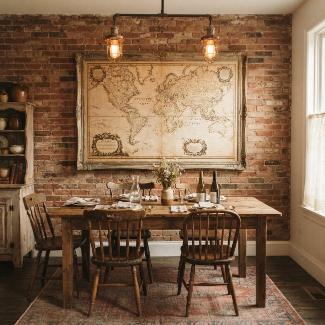
A vintage-style map adds character to a dining room in a way few other pieces can match. Whether it’s an antique reproduction or a modern map with a weathered finish, this idea brings warmth and a sense of story to the wall. As dining room wall ideas go, this one works particularly well in industrial, eclectic, or vintage-inspired spaces, where exposed brick, reclaimed wood, or metal fixtures already set a similarly worn, storied tone throughout the room. It also doubles easily as a natural conversation piece during dinner parties.
Framing choice makes a noticeable difference with this look. Weathered gold, dark wood, or distressed black frames all complement the aged tone of a map far better than sleek, modern frames would. That’s why many designers recommend pairing it with warm, low-hanging pendant lighting, since it enhances the sepia and cream tones typically found in vintage-style maps. This piece works beautifully alone as a single statement or grouped with a few small travel photographs nearby.
Layered Frame Leaning
- Creates an effortless, undone look that feels curated
- Easier to update or swap out than hung frames
- No nail holes or wall damage required
- Adds height variation that flat-hung art doesn’t offer
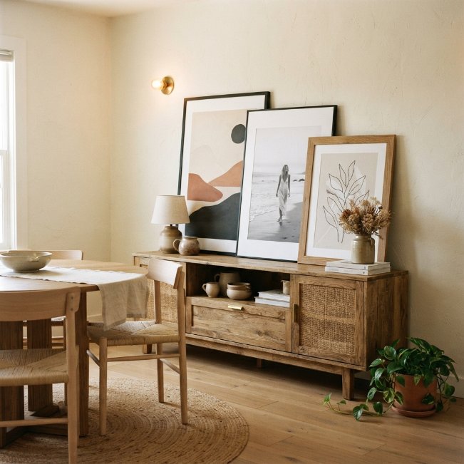
Leaning frames against the wall instead of hanging them creates an effortless, collected-over-time look. Layering two or three oversized prints, slightly overlapping, against a buffet or console gives the space a relaxed, editorial feel that’s harder to achieve with traditional hung art. This approach to decorating a dining room wall is especially popular because it requires zero tools or wall damage, making it perfect for renters or anyone who likes to change their decor often without commitment to a fixed arrangement.
Height variation is what makes this look successful. In my experience, using one large frame in the back with two progressively smaller ones layered in front creates the most natural, balanced arrangement. Avoid perfectly matching frame styles here, since a slight mismatch in size or color actually makes the look feel more intentional and curated. This idea pairs especially well with a low buffet or console table, giving the leaning frames a stable surface to rest against safely.
Rattan Mirror Cluster

- Combines light reflection with natural, textured framing
- Adds boho warmth while still brightening the room
- Easier to arrange than mixed art since shapes are uniform
- Works well in rooms with limited natural light
Rattan-framed mirrors combine the brightening benefit of glass with the warmth of natural materials. Grouped in a cluster of two or three different sizes, they reflect light around the room while adding texture that flat mirrors alone don’t provide. This idea suits dining spaces styled with woven textures, linen fabrics, or wooden furniture, tying the whole room together through shared natural materials. It’s an especially good fit for rooms facing away from direct sunlight, since the mirrors help bounce whatever light is available.
Round rattan mirrors tend to soften rectangular tables and square rooms, while oval shapes elongate narrower walls. I’ve seen this work well in coastal and boho-styled dining rooms especially, where rattan already appears in light fixtures or seating. Keep the cluster asymmetrical rather than evenly spaced, layering a large mirror with two smaller ones nearby. This creates a relaxed, gathered look that feels considered without appearing too formal or overly matched throughout the space.
Black and White Photography
- Creates a timeless look that won’t feel dated quickly
- Works in nearly any color scheme since it’s neutral
- Grid layout offers a clean, structured alternative to clusters
- Easy to personalize with family or travel photography
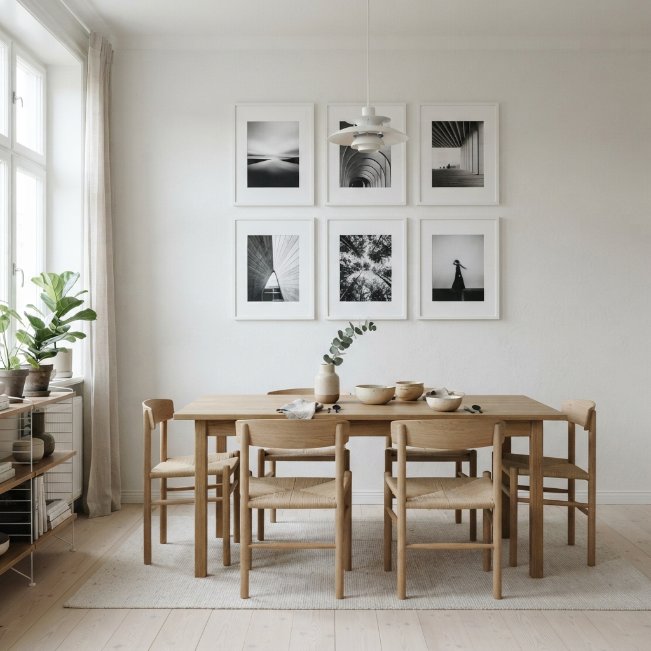
Black and white photography brings a timeless quality to dining room walls that colorful art sometimes lacks. Arranged in a clean grid, whether personal family photos or purchased prints, this look stays neutral enough to work with almost any existing color palette in the room. As far as dining room pictures for walls go, this is one of the most versatile options available, since black and white tones never clash with furniture, rugs, or table linens, regardless of how often those pieces change over time.
A grid layout, using identical frame sizes and equal spacing, creates a polished, gallery-quality result with minimal effort. I’ve tried this approach in smaller dining rooms and found that keeping frames thin and matching in color, like white or black, prevents the grid from feeling too heavy on the wall. This idea works particularly well in Scandinavian, modern, and minimalist dining rooms, where clean lines and simplicity are already central to the overall design approach.
Tapestry Wall Hanging

- Adds softness and pattern without hard framing
- Absorbs sound better than framed glass artwork
- Lightweight and simple to hang with just a rod
- Brings a global, handmade feel to the space
A woven tapestry softens a dining room wall in a way framed art rarely can. Hung from a simple wood or metal rod, it adds pattern, color, and texture while doubling as a subtle sound absorber in rooms with hard flooring. This is one of the more budget-friendly wall hanging ideas for dining room spaces, since large tapestries often cost less than equivalent-sized framed art, while still making an equally strong visual statement above a table or buffet area.
Fringe detailing along the bottom edge adds movement and a relaxed, handmade quality that pairs naturally with boho or global-inspired interiors. That’s why many designers recommend layering a tapestry behind open shelving or a low console, rather than hanging it in isolation, since it creates a fuller, more styled wall. I’ve noticed warm terracotta, rust, and cream tones tend to photograph especially well for Pinterest, making this idea popular among homeowners documenting their dining room updates online.
Corner Wall Art Nook
- Makes use of awkward, often-overlooked corner space
- Adds visual interest without competing with the main wall
- Creates a small styled moment guests notice on the way in
- Works well in rooms too small for a full gallery wall
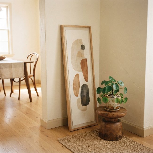
Corners often get overlooked when planning dining room wall decor, yet they offer a great opportunity for a smaller styled moment. A tall, narrow art piece leaned against the corner, paired with a small pedestal or plant stand, fills the space without requiring extra hanging hardware. This idea works especially well in compact dining rooms where every wall is already accounted for by furniture, giving homeowners one more spot to add personality without rearranging the room’s existing layout.
Height is the key to making a corner nook feel intentional rather than accidental. In my experience, choosing a piece at least four feet tall keeps the eye moving upward, making the corner feel like a designed feature rather than leftover space. Pair it with a single plant or small stack of books at the base for grounding. This idea suits nearly any style, since the corner acts as its own contained vignette separate from the main dining wall.
Neutral Abstract Art
- Adds visual interest while staying calm and versatile
- Works well as a backdrop that won’t compete with table settings
- Complements nearly any furniture style or wood tone
- Ages well without feeling trend-driven or dated
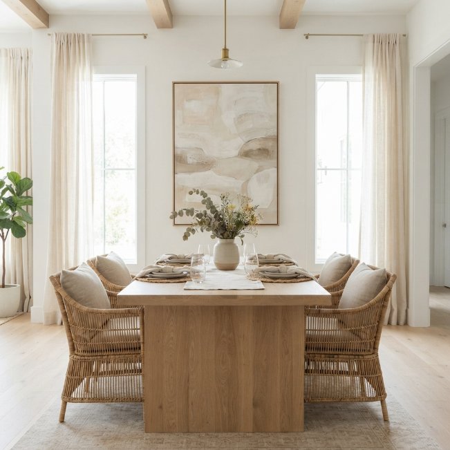
Neutral abstract art offers visual texture without introducing bold color into the dining space. Soft beige, taupe, and cream tones create movement on the wall while still keeping the overall room calm and cohesive. This approach to dining room art works especially well for households that update table linens, centerpieces, or seasonal decor often, since a neutral piece never clashes with whatever colors are layered onto the table below it throughout the year, keeping the space flexible and easy to restyle.
Texture matters as much as color with neutral art. Pieces with visible brushstrokes, plaster-like texture, or layered materials add depth that flat, single-tone prints can lack. I’ve noticed that pairing neutral abstract art with natural materials, like linen chairs or a wood table, creates a grounded, organic feel that photographs beautifully in bright, naturally lit rooms. This idea suits modern, organic, and minimalist dining rooms particularly well, especially those already leaning toward a soft, neutral color palette.
Chalkboard Menu Wall
- Adds a functional, ever-changing decor element
- Brings a fun, café-inspired personality to the room
- Great for writing menus, quotes, or seasonal messages
- Doubles as a conversation piece during gatherings
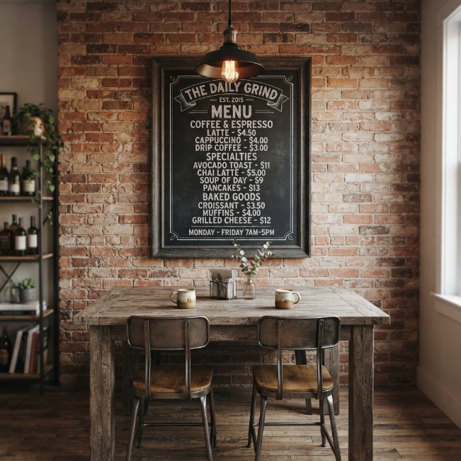
A chalkboard wall brings a playful, functional twist to dining room decor. Unlike static art, it changes based on your mood, letting you write out weekly menus, favorite quotes, or seasonal greetings for holidays and gatherings. This idea works particularly well in farmhouse, industrial, or café-inspired dining rooms, where a large framed chalkboard feels right at home alongside exposed brick, pendant lighting, and rustic wood furniture already common in that design style throughout the rest of the space.
Framing the chalkboard in reclaimed or dark-stained wood keeps it feeling intentional rather than like a leftover office supply. I’ve seen this work well in family dining rooms especially, where kids enjoy helping decorate the board for birthdays or holidays. Keep the surrounding wall decor minimal, since the chalkboard itself naturally draws attention and changes often. A single pendant light positioned above adds both function and a warm, focused glow for evening use.
Oversized Wall Clock
- Combines everyday function with strong visual impact
- Works as a single statement piece without extra styling
- Fills large wall space simply and affordably
- Suits farmhouse, industrial, and modern styles alike
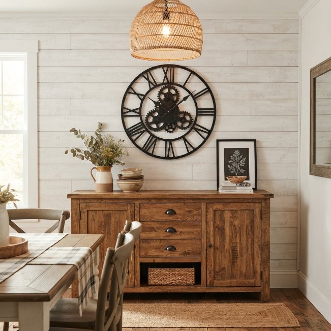
An oversized wall clock is one of the simplest ways to fill space while adding genuine function to the room. Unlike purely decorative art, it serves a purpose guests and family actually use daily, making it a practical addition to any dining room wall decor plan. Black metal or wood-framed clocks tend to work best, since their bold, simple shapes read clearly from across the room and don’t require any additional styling or grouping to feel complete on a larger, otherwise empty wall.
Placement above a buffet or centered on the main wall gives a clock the visual weight it needs to feel intentional rather than incidental. I’ve noticed that oversized clocks, at least twenty-four inches wide, make the strongest impact in dining rooms with higher ceilings or longer walls. Pair it with minimal surrounding decor, since the clock’s face and frame are already doing the visual work. This idea suits farmhouse, industrial, and modern dining spaces equally well.
Conclusion:
A dining room shouldn’t feel like an afterthought, and with the right wall decor, it never has to. From gallery walls to sculptural art and cozy woven textures, these 22 ideas prove there’s a style here for every home and every budget. I’ve seen how small changes like these can completely transform a space, turning a plain wall into the first thing guests notice when they walk in. Pick one idea that speaks to you and give it a try this week. Save this post to Pinterest for later, and share it with a friend who’s ready to refresh their own dining room too.