
20 Small Kitchen Design Ideas That Feel So Spacious
Introduction:
Small kitchen, big dreams? You’re not alone. If your kitchen feels tight, cluttered, or short on charm, these small kitchen design ideas are about to change how you see that space completely. A small footprint doesn’t mean you have to sacrifice style, storage, or comfort — it just means you need the right ideas.
In my experience, most small kitchens aren’t actually short on space. They’re short on smart planning. A few thoughtful updates, like the right layout, lighting, or color choice, can make even a tiny kitchen feel open, organized, and genuinely beautiful. I’ve noticed that homeowners are often surprised by how much difference small, intentional changes make once they see them side by side.
This article walks through 20 practical, visually inspiring ideas you can pin, save, and actually use. Whether you’re planning a full remodel or a weekend refresh, there’s something here that fits your space and your style.
Galley Kitchen Layout
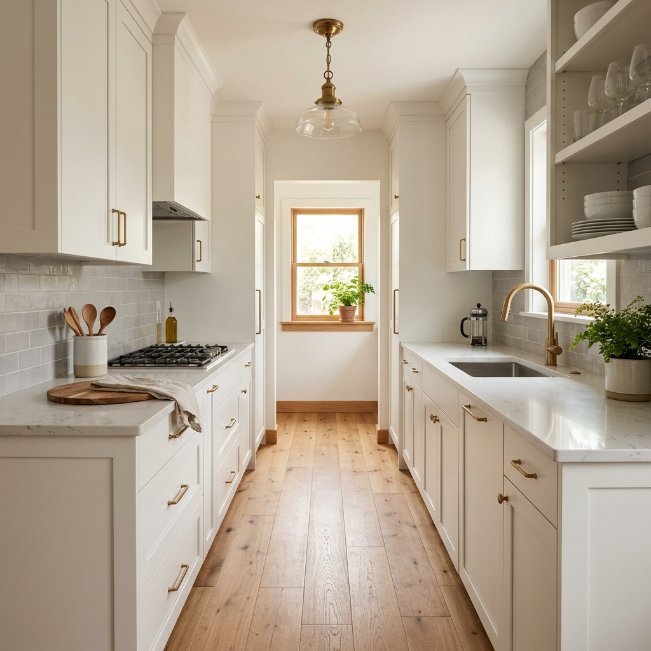
- Makes narrow spaces feel open instead of cramped
- Keeps everything within arm’s reach while cooking
- Works great for apartments and older homes
- Adds visual length when you use lighter tones
- Cuts down on wasted walking space
The galley layout is often overlooked, but it’s one of the smartest small kitchen design ideas for tight floor plans. Two parallel counters create a natural workflow, so everything from the stove to the sink feels within easy reach. In my experience, this layout works especially well for people who cook often, since nothing feels far away. When paired with light cabinetry and a simple backsplash, it visually stretches the room instead of closing it in.
What makes this idea so popular on Pinterest is how adaptable it feels. You can dress it up with brass fixtures for a warmer look, or keep it minimal with matte white for a modern feel. I’ve noticed that adding a single pendant light above the counter instantly makes the space feel intentional rather than purely functional. It’s a simple layout, but it solves real problems for small kitchens where every inch truly counts toward comfort and flow.
Floating Wall Shelves
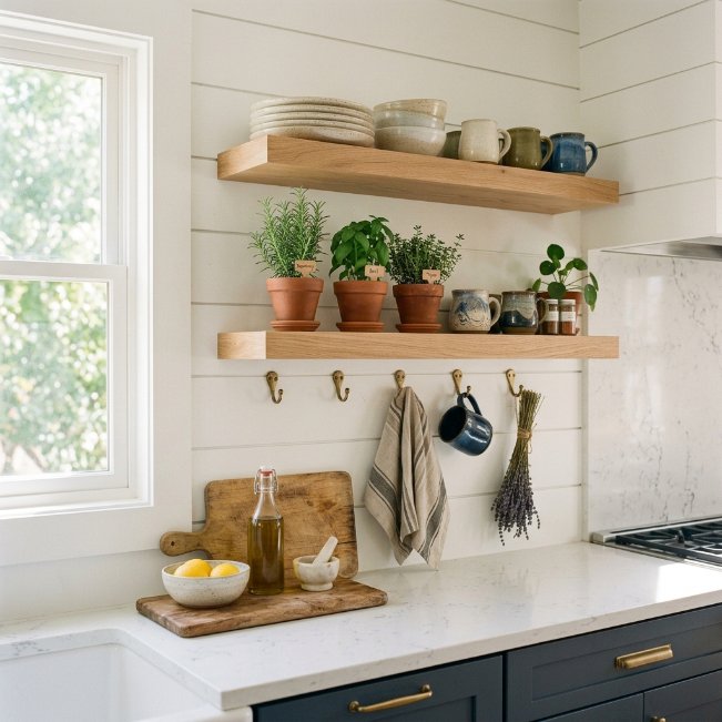
- Frees up visual space compared to bulky cabinets
- Great for displaying everyday dishes or plants
- Adds warmth and personality to plain walls
- Keeps frequently used items easy to grab
- Works well above counters or open corners
Floating shelves are a favorite among small kitchen design ideas because they open up the room without adding bulk. Unlike upper cabinets, they let light travel freely across the space, which makes even a tiny kitchen feel airier. I’ve seen this work well in many homes where wall cabinets felt too heavy for the room’s scale. A few shelves with simple dishware or a small plant instantly add charm without overwhelming the layout.
They’re also incredibly practical for everyday use. Instead of digging through cabinets, you get quick access to mugs, plates, or spices you use daily. That’s why many designers recommend mixing shelves with a few closed cabinets, so you get storage and openness at once. On Pinterest, this idea consistently performs well because it photographs beautifully while still feeling completely livable and realistic for everyday kitchens.
Compact Kitchen Island
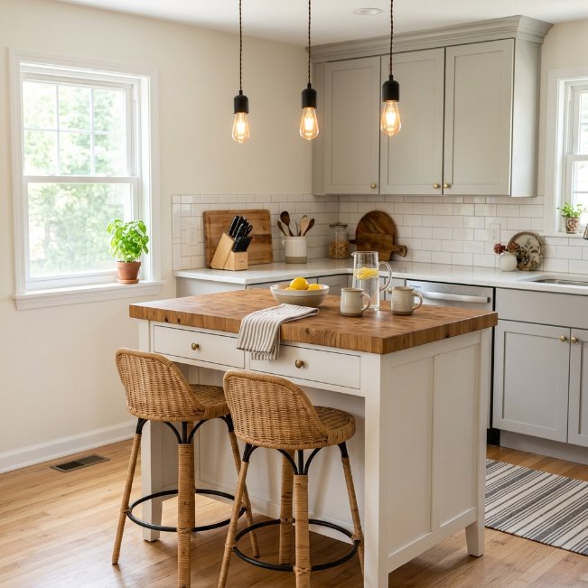
- Adds extra prep space without crowding the room
- Doubles as a casual seating or dining spot
- Provides hidden storage for pots, pans, or pantry items
- Anchors the kitchen visually, even in small footprints
- Great for open-concept or studio-style homes
A compact island proves that even the smallest kitchens can have a functional centerpiece. This is one of the most requested small kitchen design layout ideas because it adds counter space, storage, and seating all in one footprint. In my experience, a rolling or slim-profile island works best in tighter rooms, since it doesn’t block natural walking paths. Adding a butcher block top brings warmth and contrast against lighter cabinetry, making the whole kitchen feel more finished.
Beyond the visual appeal, islands genuinely change how a kitchen functions day to day. They give you a spot to prep meals, eat breakfast, or set down groceries without cluttering the counters. I’ve noticed homeowners often underestimate how much a small island improves flow until they actually add one. Even at 24 to 30 inches wide, it can transform a cramped layout into a space that feels organized, social, and surprisingly spacious.
Two-Tone Cabinets
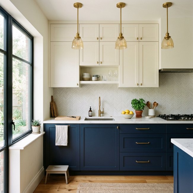
- Adds depth and contrast without shrinking the room
- Draws the eye without overwhelming a small footprint
- Makes upper cabinets feel lighter and less bulky
- Grounds the space with a bold lower tone
- Pairs well with brass, gold, or matte black hardware
Two-tone cabinetry is one of those kitchen design decorating ideas that looks bold in photos but works beautifully in real, everyday spaces. By keeping the upper cabinets light and the lower ones darker, the eye naturally lifts upward, which makes ceilings feel taller and the room feel more open. I’ve tried this combination in narrow kitchens before, and it consistently softens the boxed-in feeling that dark cabinetry alone can create. It’s a simple contrast trick that photographs incredibly well for Pinterest boards.
What makes this idea last beyond trends is its flexibility. You can choose a moody navy, deep green, or soft charcoal for the lower cabinets and keep the top half crisp white or cream. That’s why many designers recommend this approach for renters or small updates, since only the lower cabinets need repainting. The result is a kitchen that feels custom-designed, layered, and intentional, even in a modest-sized room with limited square footage.
Open Shelving Corner
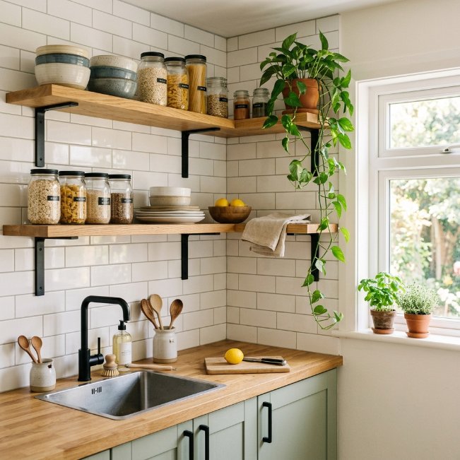
- Removes visual heaviness from upper cabinet areas
- Encourages a curated, clutter-free display style
- Makes ceilings and walls feel taller
- Works well in corners that feel boxed in
- Easy to update seasonally with new decor
Turning one corner into open shelving is a small change that makes a big visual difference. Instead of a full run of upper cabinets, this idea keeps just one section open, giving the eye a place to rest. I’ve noticed this works especially well in kitchens where the corner already feels tight or dark, since removing a door and panel instantly adds breathing room. It’s one of the easier tiny kitchen design ideas to try without a full renovation.
The styling opportunity here is part of the appeal too. A few matching bowls, glass canisters, or a small plant can turn empty shelf space into a cozy focal point. In my experience, keeping the display simple, no more than a handful of items, is what keeps this look feeling intentional rather than cluttered. It’s a low-cost update that consistently performs well on Pinterest because it feels both achievable and genuinely stylish.
Mirrored Backsplash
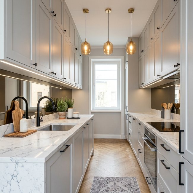
- Bounces natural and artificial light around the room
- Creates the illusion of a wider, deeper kitchen
- Adds a subtle glamorous touch without heavy decor
- Reflects countertop colors for a cohesive look
- Easy to maintain with regular glass cleaner
A mirrored backsplash is an unexpected but effective trick among small kitchen design ideas because it plays directly with light and depth. Instead of absorbing light like tile or paint, mirrored glass reflects it, which makes the entire kitchen feel roomier almost instantly. I’ve seen this work well in many homes with limited natural light, since it bounces whatever brightness is available across the whole room. It’s a subtle upgrade, but the visual payoff is noticeably bigger than the effort involved.
Beyond the light benefits, this idea adds a soft, elevated feel without requiring bold colors or busy patterns. The reflective surface naturally complements marble, quartz, or warm wood tones already in the kitchen. In my experience, pairing it with simple matte black or brass fixtures keeps the look balanced instead of overly flashy. It’s a design choice that feels fresh on Pinterest while still being practical enough for daily cooking and cleaning routines.
Vertical Pantry Cabinet
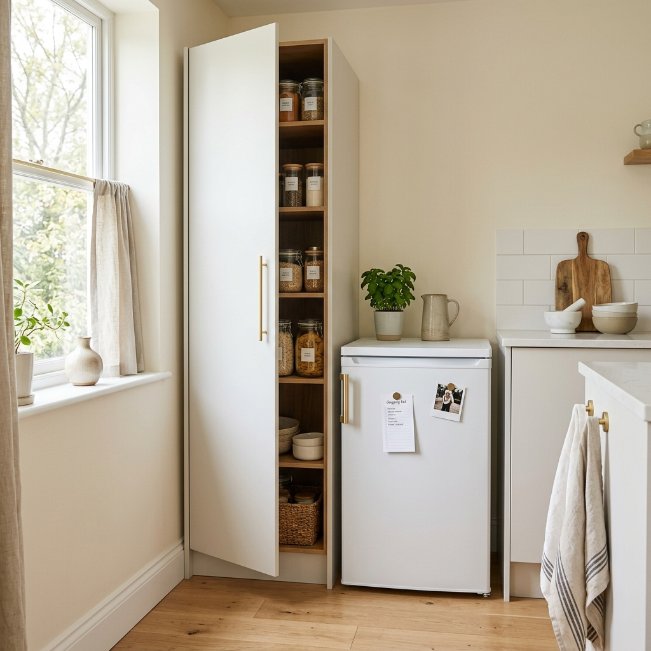
- Uses vertical space instead of eating into floor area
- Keeps pantry items organized and out of sight
- Fits neatly into narrow gaps between appliances
- Adds serious storage without a full renovation
- Makes the kitchen feel tidier at a glance
A tall, narrow pantry cabinet is one of the smartest fixes for kitchens that are short on square footage. Rather than expanding outward, this idea grows upward, tucking neatly into gaps beside a fridge or at the end of a counter run. I’ve tried this in small apartment kitchens where floor space was almost nonexistent, and it completely changed how much I could store without feeling cramped. It’s a practical answer to one of the most common frustrations with small kitchen design layout ideas.
Visually, it also keeps the room looking clean and uncluttered. Because everything stays hidden behind one door, countertops stay clear and the overall kitchen feels calmer. I’ve noticed that homeowners who add a vertical pantry often stop reaching for extra counter organizers altogether, since everything finally has a proper place. It’s a simple structural addition, but it solves both a storage problem and a visual one at the same time.
Under-Cabinet Lighting
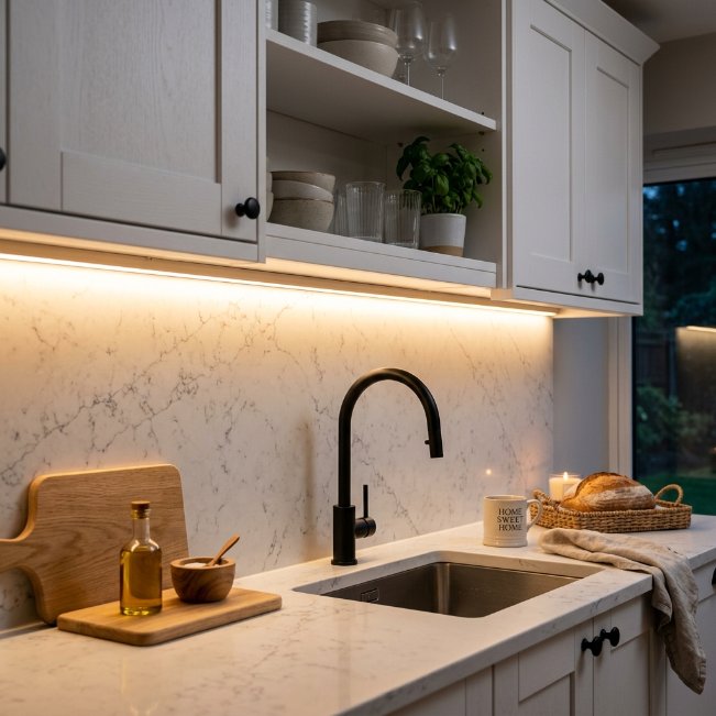
- Brightens work areas without harsh overhead light
- Adds a warm, inviting glow in the evening
- Makes countertops and backsplash details stand out
- Improves visibility for chopping and prepping food
- Easy to install without major electrical work
Under-cabinet lighting might be one of the most underrated small kitchen design ideas, simply because it solves a problem most people don’t think about until it’s fixed. Overhead lighting alone often leaves counters in shadow, especially in galley or single-wall kitchens. Adding a warm LED strip beneath the cabinets changes that instantly, giving you clear, even light exactly where you’re chopping, mixing, or plating food. It’s a small addition that makes cooking noticeably easier and more enjoyable.
The visual effect is just as strong as the functional one. In the evening, that soft glow adds warmth and depth, making the kitchen feel more like a finished, styled space rather than a purely practical one. I’ve seen this work well in many homes where the backsplash or countertop material finally gets to shine once proper lighting highlights its texture. It’s an easy, affordable update that consistently photographs beautifully for Pinterest boards.
Glass-Front Cabinets
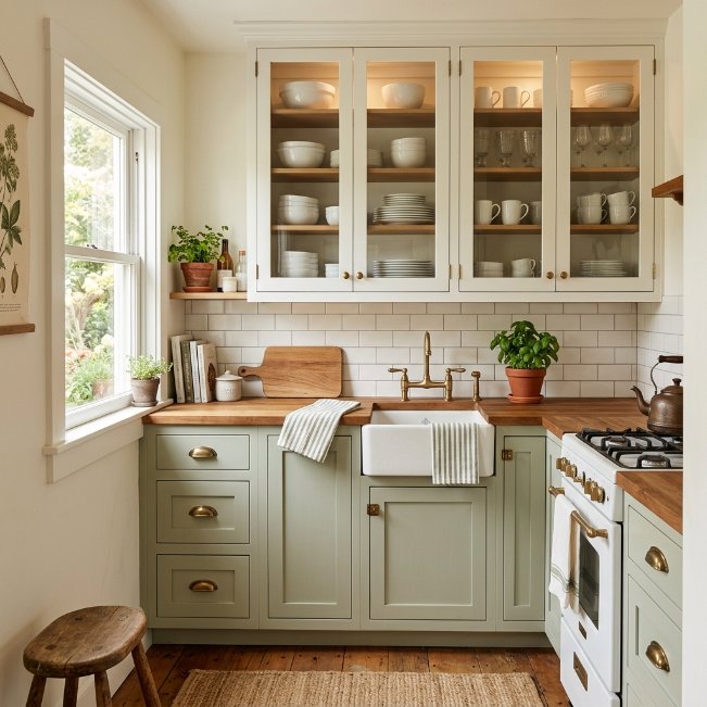
- Adds depth by revealing what’s stored inside
- Softens the look of solid, boxy cabinetry
- Encourages organized, intentional dish arrangement
- Pairs beautifully with colorful or patterned dishware
- Creates a lighter feel than solid cabinet doors
Glass-front cabinets bring a layered, boutique feel to even the simplest kitchen design ideas. Instead of a flat wall of solid doors, glass panels add visual depth, letting the eye see through rather than stop abruptly at a surface. In my experience, this works especially well in cottage or vintage-inspired kitchens, where displaying pretty dishware becomes part of the decor itself. It’s a detail that turns storage into styling, which is exactly the kind of idea that performs well on Pinterest.
That said, this idea does require a bit more upkeep, since the inside needs to stay tidy. I’ve noticed that homeowners who commit to this look tend to organize by color or type, which keeps things looking curated rather than messy. Pairing glass fronts with a soft cabinet color, like sage green or pale blue, adds even more charm. It’s a small architectural change that makes a lasting visual impact on the whole room.
Corner Sink Placement
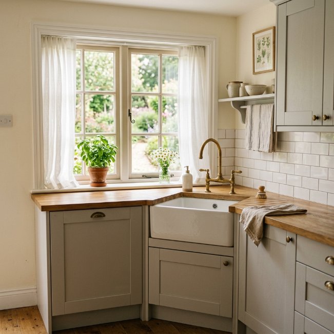
- Frees up straight counter runs for more workspace
- Makes awkward corners genuinely functional
- Creates a natural focal point near a window
- Improves traffic flow in tight kitchen layouts
- Adds charm with minimal structural change
Placing the sink in a corner is one of those small kitchen design layout ideas that solves a problem most people don’t realize they have until they see it done well. Straight-wall layouts often waste corner space entirely, but angling the sink there frees up the rest of the counter for prepping and cooking. I’ve tried this layout in a compact kitchen before, and it genuinely opened up more usable space than I expected. It also tends to sit right under a window, which adds natural light exactly where you need it most.
Beyond the practical side, this placement adds real personality to the room. A farmhouse-style basin paired with a gooseneck faucet instantly feels charming and intentional rather than accidental. I’ve noticed that corner sinks work particularly well in L-shaped kitchens, where the layout already bends naturally. It’s a layout choice that feels fresh on Pinterest boards while genuinely improving how the kitchen functions day to day for real households.
Slim Rolling Cart
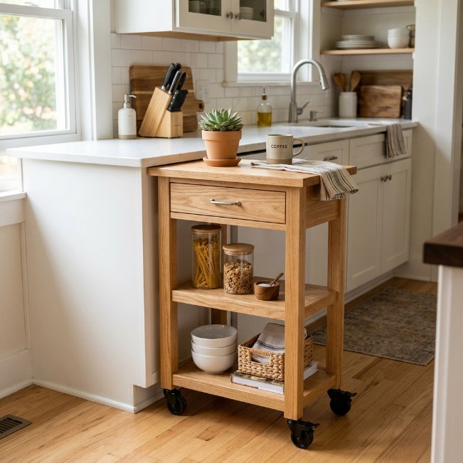
- Adds movable counter and storage space instantly
- Rolls easily wherever extra workspace is needed
- Requires no installation or permanent commitment
- Perfect for renters or frequently rearranged layouts
- Doubles as a bar cart or serving station
A slim rolling cart is one of the easiest small kitchen design ideas to try because it requires zero renovation. It simply rolls into place, offering extra counter space, shelving, or even a mini bar setup whenever you need it. I’ve seen this work well in many rental kitchens, where permanent changes aren’t an option but extra function still matters. Because it moves freely, you can tuck it against a wall when not in use or wheel it out during meal prep or gatherings.
What makes this idea especially popular on Pinterest is its flexibility and charm. A simple wood cart with a few styled jars or a small plant instantly feels curated rather than makeshift. In my experience, choosing a narrow cart, around 12 to 16 inches wide, keeps it useful without crowding the walkway. It’s a low-commitment addition that solves real storage gaps while still contributing to the overall look and flow of the kitchen.
Light Wood Flooring
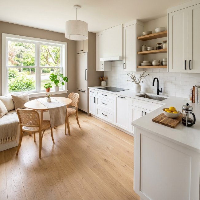
- Reflects more natural light across the room
- Creates a seamless, expansive flooring effect
- Balances cooler cabinet tones with warmth
- Works well with almost any cabinet color
- Hides minor scuffs better than very dark floors
Light wood flooring quietly does a lot of visual work in small kitchen design ideas, even though it’s easy to overlook. Because pale tones reflect more natural light than dark flooring, the entire room instantly feels brighter and larger than it actually is. I’ve noticed this effect most clearly in kitchens with limited windows, where every bit of reflected light genuinely matters. Pairing it with white or light-toned cabinetry creates a seamless, continuous look that makes the floor feel like it stretches further than it really does.
Practically speaking, light wood also tends to hide everyday wear better than very dark stains, which show scuffs and dust more easily. That’s why many designers recommend it for busy households with kids or pets. In my experience, a matte or low-sheen finish keeps the look modern rather than dated. It’s a foundational choice that supports almost any color palette layered on top, making it a smart long-term investment for small spaces.
Open Wall Cutout
- Connects the kitchen visually to the next room
- Lets natural light travel between spaces
- Makes a closed-off kitchen feel less isolated
- Doubles as a pass-through serving spot
- Improves conversation flow during cooking or gatherings
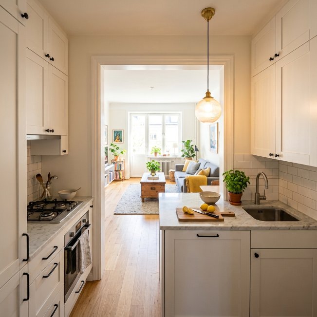
An open wall cutout is a bigger structural idea, but it’s one of the most effective small kitchen design ideas for homes with a separate, boxed-in kitchen. Instead of a full wall separating rooms, a cutout section lets light and sightlines pass through, which makes the kitchen feel connected to the rest of the home rather than sealed off. I’ve seen this work well in many older homes where the original layout closed the kitchen off completely. Even a modest opening changes how the whole floor plan feels.
Functionally, it also becomes a natural pass-through for food, drinks, or conversation while cooking. Families with young kids often appreciate being able to see and talk to them from the kitchen instead of feeling isolated behind a wall. In my experience, framing the opening with a simple ledge or small counter adds even more usefulness. It’s a bigger commitment than most ideas on this list, but the payoff in daily livability is significant.
Matte Black Fixtures
- Adds sharp contrast against light cabinetry
- Modernizes the kitchen without a full renovation
- Creates a cohesive look across faucet, handles, and lighting
- Works well with almost any color palette
- Easy, affordable swap compared to cabinet changes
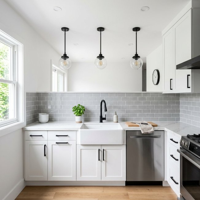
Matte black fixtures are a small but powerful way to modernize a kitchen without touching cabinetry or layout at all. Swapping out a faucet, cabinet pulls, and light fixtures for matte black versions instantly adds contrast and definition to an otherwise light, neutral space. I’ve tried this update myself in a kitchen that felt a little flat, and the difference was noticeable almost immediately. It’s one of the most budget-friendly kitchen design decorating ideas because it doesn’t require any structural work, just thoughtful hardware choices.
Consistency is what makes this idea look intentional rather than random. Matching the faucet finish to the cabinet handles and pendant lights ties the whole room together visually. I’ve noticed that homeowners who mix too many finishes, brass, chrome, and black together, end up with a busier look than intended. Sticking to one dark finish throughout keeps things clean and cohesive, which is exactly the kind of polished detail that photographs well for Pinterest inspiration boards.
Built-In Banquette Seating
- Maximizes seating without needing extra chairs
- Uses corner space that would otherwise sit empty
- Adds soft texture and warmth to the room
- Provides hidden storage underneath the bench
- Creates a cozy, casual dining nook
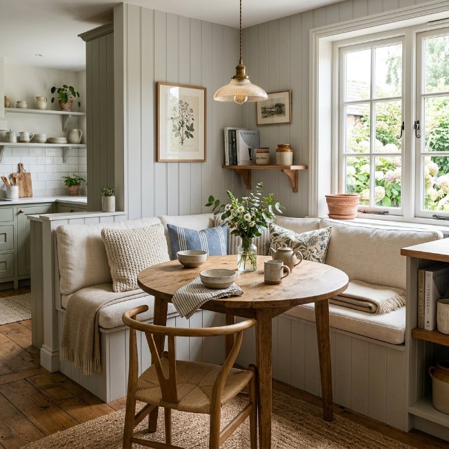
Built-in banquette seating turns an unused corner into one of the coziest features a small kitchen can have. Instead of pulling in bulky chairs, a bench-style seat tucks neatly against the wall, freeing up floor space while still comfortably seating several people. I’ve seen this work well in many compact dining nooks, where a traditional table-and-chair setup simply wouldn’t fit as efficiently. It’s one of those small kitchen design ideas that feels like a splurge but genuinely earns its keep in daily life.
Beyond seating, the bench often doubles as hidden storage, which is a huge bonus in a space where every cabinet counts. Soft cushions and a paneled backrest also add texture that plain chairs can’t match. In my experience, pairing the banquette with a round table softens the room’s corners and improves flow for smaller kitchens. It’s a feature that consistently draws attention on Pinterest because it feels both charming and genuinely livable.
Warm Wood Accents
- Softens an all-white kitchen with natural warmth
- Adds texture without introducing bold color
- Balances cool countertops and stainless appliances
- Creates a cozy, inviting atmosphere instantly
- Works well on islands, shelves, or range hoods
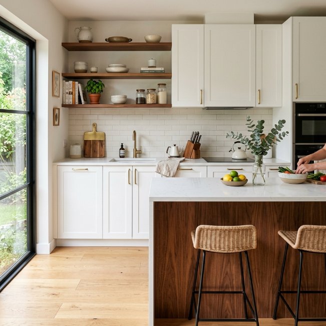
Warm wood accents are one of the easiest ways to keep a small kitchen from feeling too cold or clinical. All-white or all-gray kitchens can start to feel sterile, but adding a wood island panel, open shelf, or range hood immediately brings in natural texture and warmth. I’ve noticed this contrast works especially well in modern kitchens that lean heavily on quartz and stainless steel, since the wood softens all that hard, reflective surface. It’s a subtle layering technique rather than a full redesign.
This idea also has staying power because wood tones rarely go out of style the way trendy paint colors sometimes do. In my experience, choosing a warm walnut or light oak accent, rather than matching every wood tone in the room exactly, actually looks more natural and collected. That’s why many designers recommend mixing at least one wood element into predominantly white or gray kitchens. It’s a detail that photographs beautifully and adds real warmth to everyday cooking spaces.
Peninsula Counter Layout
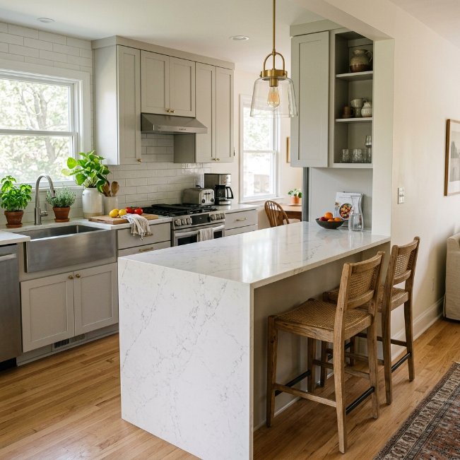
- Adds counter space without a full island footprint
- Creates a natural boundary between kitchen and living area
- Provides casual seating for quick meals
- Works well in open-concept small homes
- Requires less clearance than a freestanding island
A peninsula counter offers many of the same benefits as a kitchen island, but with a smaller footprint that fits tighter layouts. Because one end connects directly to existing cabinetry, it needs less walking clearance than a freestanding island, which makes it one of the more practical small kitchen design layout ideas for open-concept homes. I’ve tried this setup in a compact space before, and it added both prep room and casual seating without making the kitchen feel crowded or hard to move through.
Visually, a peninsula also does a nice job of defining the kitchen area within an open floor plan, without needing a full wall. It signals where the kitchen ends and the living space begins while still keeping sightlines open. I’ve noticed that adding two stools underneath makes it double as a casual breakfast spot, which families use far more often than a formal dining table. It’s a smart, space-conscious layout that balances function and openness.
Statement Range Hood
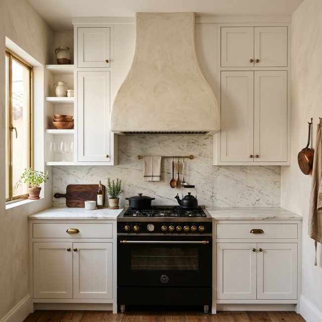
- Turns a functional necessity into a design focal point
- Adds texture and shape without extra furniture
- Draws the eye upward, making ceilings feel taller
- Works as a centerpiece even in tiny kitchens
- Pairs well with minimal surrounding decor
A statement range hood takes something purely functional and turns it into the visual centerpiece of the kitchen. Instead of a plain stainless hood tucked away, a curved plaster or wood-toned hood becomes the first thing people notice, which is especially valuable in small kitchens that don’t have room for much extra decor. I’ve seen this work well in many compact kitchens where wall space was too limited for artwork or shelving, so the hood itself became the design statement instead.
Because it draws the eye upward, a bold hood shape also makes ceilings feel taller than they actually are, which is a helpful trick in cozier rooms. In my experience, keeping the surrounding cabinetry and backsplash simple lets the hood really stand out without competing for attention. It’s one of those kitchen design ideas that feels high-end and editorial, which is exactly the aesthetic that tends to get saved and shared repeatedly on Pinterest boards.
Textured Tile Backsplash
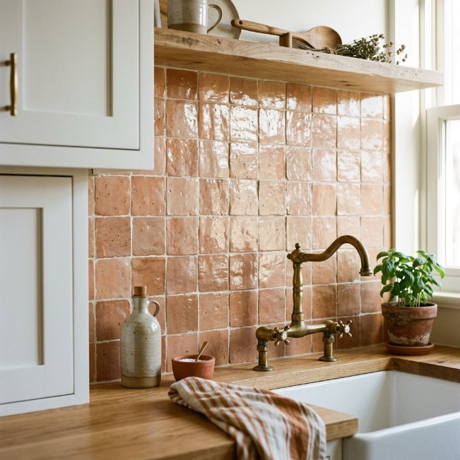
- Adds depth and character beyond flat, glossy tile
- Reflects light unevenly for a warm, organic glow
- Works as a focal point without extra decor
- Pairs beautifully with simple, uncluttered cabinetry
- Elevates the whole kitchen with one design layer
A textured backsplash, like handmade zellige or fluted ceramic tile, brings a level of depth that flat subway tile simply can’t match. The slightly uneven surface catches natural light differently across the day, creating subtle shadows and warmth that make the kitchen feel alive rather than static. I’ve noticed this effect is especially striking in kitchens with a window nearby, since the changing light constantly shifts how the tile looks. It’s one of those small kitchen design ideas that does most of the visual work on its own.
Because the texture already adds so much personality, the rest of the kitchen can stay fairly simple without feeling boring. In my experience, pairing a bold tile choice with plain cabinetry and minimal hardware keeps the whole space balanced instead of overwhelming. That’s why many designers recommend choosing one statement element, like this backsplash, rather than layering multiple bold choices at once. It’s a detail-driven upgrade that consistently earns saves and repins on Pinterest boards.
Tuscan-Inspired Warm Palette
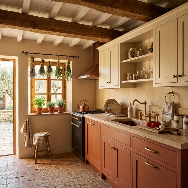
- Brings warmth through earthy, sun-washed color tones
- Adds rustic charm with natural materials and textures
- Feels cozy and lived-in rather than sterile
- Works well with stone, wood, and wrought iron
- Creates a timeless look that resists quick trends
A Tuscan-inspired palette leans into warm terracotta, cream, and olive tones that feel sun-washed and inviting, even in a small kitchen. Unlike stark white or gray schemes, this approach uses earthy color and natural materials, like stone countertops or exposed wood beams, to create a space that feels layered and lived-in. I’ve tried incorporating just one or two of these elements, like a terracotta lower cabinet paired with cream uppers, and it warmed up the whole room without requiring a complete overhaul of the kitchen.
What makes tuscan kitchen design ideas especially appealing is their timeless quality. Because the palette draws from natural materials rather than trendy paint colors, it tends to age gracefully instead of feeling dated within a few years. I’ve seen this work well in older homes with existing wood beams or stone details, where leaning into that character feels more authentic than fighting against it. It’s a warm, grounded aesthetic that continues to perform strongly across Pinterest inspiration boards.
Conclusion:
A small kitchen doesn’t have to feel small forever. With the right small kitchen design ideas, even the tightest layout can feel open, organized, and genuinely beautiful. I’ve seen how small changes, like better lighting, smarter storage, or a fresh color palette, can completely transform how a space looks and feels day to day.
Now it’s your turn. Save this post to your Pinterest boards, try one idea this week, and share it with anyone dreaming of a cozier, more functional kitchen. Sometimes, the smallest updates create the biggest transformations.