
24 Gorgeous Bathroom Paint Ideas Worth Trying Today
Introduction:
Staring at a blank bathroom wall, wondering if the right color could actually change everything? It can. A small can of paint holds more power than most people realize, and these bathroom paint ideas prove exactly that.
Whether you’re working with a tiny powder room or a spacious primary bath, the color on your walls sets the entire mood of the space. In my experience, homeowners often underestimate paint as a design tool, saving it for last when it should be one of the first decisions made. The right shade can make a cramped bathroom feel open, turn a dated space into something that feels custom, and completely shift how a room makes you feel every single morning.
Soft Sage Green
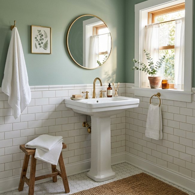
- Brings a calming, nature-inspired feel to even the tiniest bathroom
- Pairs beautifully with white tile, brass, and natural wood accents
- Hides everyday water splashes and small imperfections better than stark white
- Works in both modern farmhouse and traditional bathroom styles
- Feels fresh without being too bold or trendy
Sage green has become one of the most requested bathroom paint ideas for homeowners who want color without commitment. It sits comfortably between neutral and bold, which makes it forgiving in small spaces where light shifts throughout the day. In my experience, this shade looks completely different in morning versus evening light, so it’s worth testing a sample swatch on the wall for at least 24 hours. That single step saves so many people from repainting later.
This color also plays well with almost any bathroom hardware finish, from brushed nickel to warm brass. That flexibility matters because most homeowners aren’t ready to renovate their entire fixture set just to update wall color. Sage green softens harsh lighting, especially in bathrooms with limited natural light, and it photographs beautifully for anyone documenting a renovation. It’s a low-risk, high-reward choice that consistently shows up on Pinterest boards for a reason — it simply works in real homes.
Warm Terracotta Accent
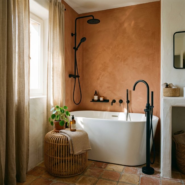
- Adds warmth and personality without overwhelming a small space
- Creates a natural focal point around a tub or vanity
- Balances beautifully with black or matte black fixtures
- Makes white tile and fixtures feel intentional rather than plain
- Great option for those wanting color without a full-room commitment
An accent wall is one of the smartest painting ideas for bathroom spaces that feel too small for bold color everywhere. Terracotta brings warmth and depth, especially in bathrooms that lean cold due to tile or metal finishes. I’ve noticed that homeowners who hesitate to commit to an all-over color often find accent walls to be the perfect middle ground. It delivers impact while keeping most of the room light and airy, which matters in bathrooms without much natural light to spare.
This approach also photographs incredibly well, which is part of why it performs so strongly on Pinterest. A single terracotta wall behind a tub or vanity instantly becomes the room’s focal point, drawing the eye without demanding a full renovation. It pairs naturally with black hardware, woven textures, and greenery, giving the space a boutique-hotel feel. For anyone nervous about color, this is one of the easiest ways to test a bold shade with minimal long-term risk involved.
Classic Navy Blue
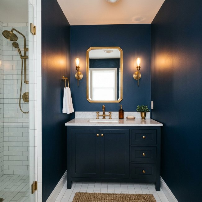
- Creates a moody, upscale look that feels expensive
- Contrasts beautifully with white tile, marble, and brass details
- Works well in powder rooms and guest bathrooms especially
- Hides scuffs and water marks better than lighter shades
- Adds instant sophistication without needing major renovation work
Navy blue consistently ranks among the best paint colors for bathrooms that want to feel elevated and polished. It’s dramatic enough to make a statement but classic enough that it won’t feel dated in a few years. That’s why many designers recommend navy for powder rooms specifically, since guests only spend a few minutes in the space and the boldness reads as intentional rather than overwhelming. It also hides fingerprints and daily wear far better than lighter, more delicate colors do.
Pairing navy with brass or gold hardware creates a rich, hotel-like atmosphere that feels far more expensive than the actual cost of a paint can. White marble, subway tile, or simple white trim keeps the space from feeling too dark or closed in. This combination shows up constantly across bathroom color ideas on Pinterest because it photographs beautifully in both daylight and warm evening lighting, making it a reliable favorite for anyone wanting drama without regret.
Blush Pink Walls
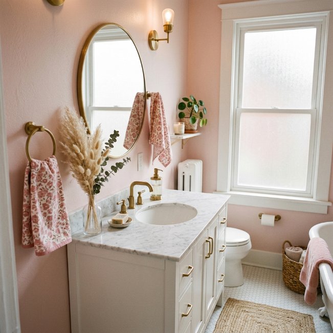
- Adds a soft, flattering glow that makes skin tones look warmer
- Feels fresh and modern rather than overly sweet or childish
- Works beautifully with brass, gold, or matte black hardware
- Brightens small windowless bathrooms without feeling cold like pure white
- Pairs effortlessly with marble, wood, and neutral textures
Blush pink has moved far beyond nursery walls and become one of the most searched bathroom color ideas for adults wanting warmth without commitment to a bold hue. The right dusty, muted shade avoids feeling too sweet, landing instead somewhere between neutral and romantic. I’ve seen this work well in many homes with limited natural light, since the pink undertone reflects warmly even under artificial bulbs. It’s especially popular in powder rooms where a little personality feels welcome and appropriate.
What makes blush so versatile is its ability to sit quietly in the background or become the star, depending on what it’s paired with. Add gold fixtures and marble for a glam finish, or keep it simple with white trim and natural wood for something more relaxed. Either way, this shade consistently photographs well for Pinterest, which explains its ongoing popularity. It’s a color that feels intentional, current, and surprisingly easy to live with daily.
Creamy Off-White
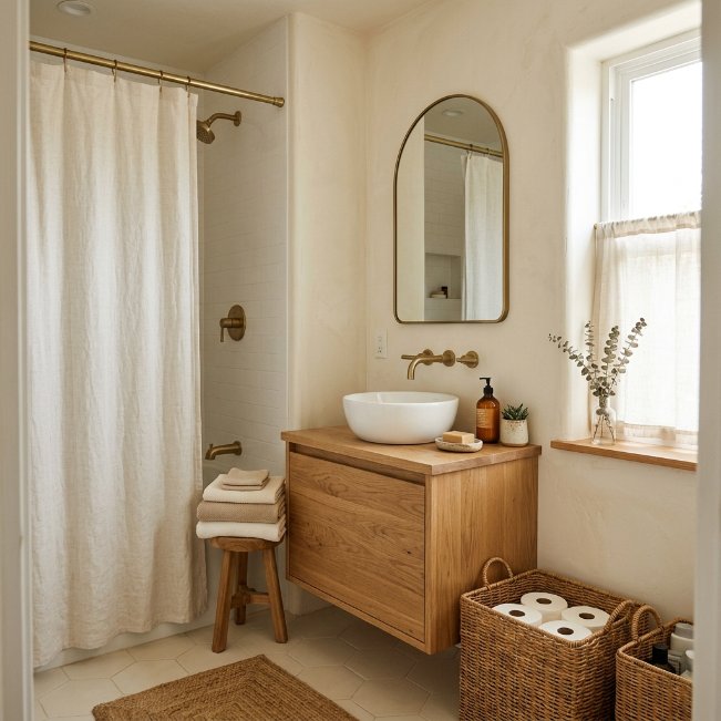
- Creates a bright, timeless base that never feels outdated
- Reflects natural and artificial light better than stark white
- Pairs effortlessly with wood tones, wicker, and linen textures
- Makes small bathrooms feel larger and more open
- Works as a safe, resale-friendly option for most home styles
Creamy off-white remains one of the most reliable choices among small bathroom paint color ideas because it solves a common problem: stark white can feel clinical and cold, especially in rooms without much natural light. A warmer off-white softens that harshness while still keeping the space feeling open and airy. In my experience, this shade works particularly well in bathrooms with wood or wicker accents, since it lets natural textures stand out instead of competing with a heavily pigmented wall color.
This option also tends to be the safest choice for anyone preparing to sell their home, since it appeals to nearly every buyer’s taste. It photographs beautifully in natural light, making it a Pinterest favorite for minimalist and organic-modern bathroom styles. Off-white doesn’t try to make a bold statement, and that’s exactly its strength. It creates a calm, versatile backdrop that lets furniture, lighting, and small decorative touches do the visual work instead.
Charcoal Grey Contrast
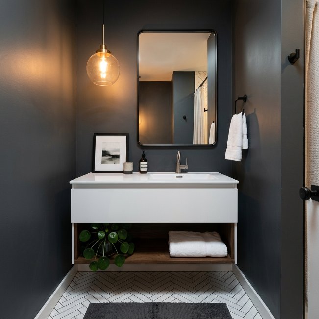
- Adds bold contrast that makes white fixtures and tile pop
- Creates a modern, spa-like atmosphere in even tiny bathrooms
- Hides water spots, mildew streaks, and daily wear effectively
- Works especially well with floating vanities and open shelving
- Pairs naturally with brushed metal and matte black finishes
Charcoal grey is a fantastic pick among bold paint ideas for bathroom spaces that want a modern, editorial look. Unlike black, which can feel heavy in small rooms, charcoal offers depth without closing the space in visually. That’s why many designers recommend it for bathrooms with strong natural light, since the darkness balances out brightness instead of competing with it. Paired with white tile or a floating vanity, the contrast creates a striking, magazine-worthy result that still feels livable day to day.
Practically speaking, darker walls also hide the small imperfections that show up constantly in bathrooms, like water splashes, soap residue, or minor scuffs near the sink. That makes charcoal a smart choice for busy households, not just a stylish one. This shade shows up frequently across bathroom color schemes on Pinterest because it strikes a rare balance between drama and practicality, giving homeowners a bold look that doesn’t sacrifice everyday function or easy maintenance.
Muted Lavender Tone
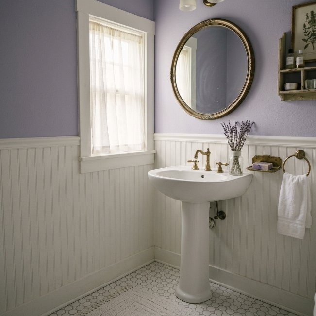
- Adds a calm, spa-like feel without leaning too feminine or bold
- Works beautifully with white beadboard, wainscoting, and vintage details
- Softens harsh overhead lighting common in small bathrooms
- Pairs naturally with brass, nickel, and soft white accents
- Feels fresh and modern rather than dated or overly pastel
Muted lavender is one of those quietly popular small bathroom paint ideas that rarely gets talked about but consistently performs well in real homes. Unlike brighter purples, a dusty, greyed-out lavender feels sophisticated rather than childish, which makes it easier to live with long term. I’ve noticed this shade works especially well in bathrooms with cooler natural light, since it adds warmth without shifting into a color that feels overly saturated or trendy in a way that dates quickly.
This tone also pairs effortlessly with vintage-inspired details like beadboard, brass hardware, and antique mirrors, giving small bathrooms a cottage-like charm. It softens the space visually while still allowing white fixtures and trim to stand out clearly. Because it sits in a lesser-used color family, lavender bathrooms tend to feel more unique and memorable on Pinterest boards. It’s a gentle way to introduce color for anyone hesitant about committing to something bolder or more saturated.
Deep Forest Green
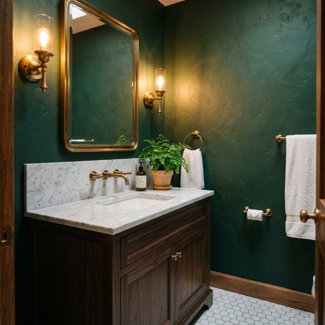
- Creates a rich, luxurious feel similar to high-end hotel bathrooms
- Pairs beautifully with brass, marble, and natural wood tones
- Works well in bathrooms with strong artificial or warm lighting
- Adds depth and drama without feeling overly dark or closed in
- Complements greenery and natural textures for an organic touch
Deep forest green continues to trend among the best bathroom colors for homeowners wanting a dramatic yet timeless look. It draws inspiration from nature, which explains why it feels so calming despite being a genuinely bold, saturated color choice. That’s why many designers recommend pairing it with warm lighting and brass fixtures, since the combination creates a rich, layered atmosphere rather than a flat, dark box. Even small bathrooms handle this shade well when paired with lighter flooring and mirrors.
Forest green also has staying power in a way that trendier colors often lack, making it a smart long-term investment rather than a passing fad. It photographs exceptionally well under warm lighting, which is part of why it performs so strongly across Pinterest inspiration boards. Homeowners consistently describe this shade as feeling expensive and intentional, even in budget-friendly renovations. Paired with marble or wood accents, it delivers a boutique hotel feel without requiring a full remodel.
Light Sky Blue
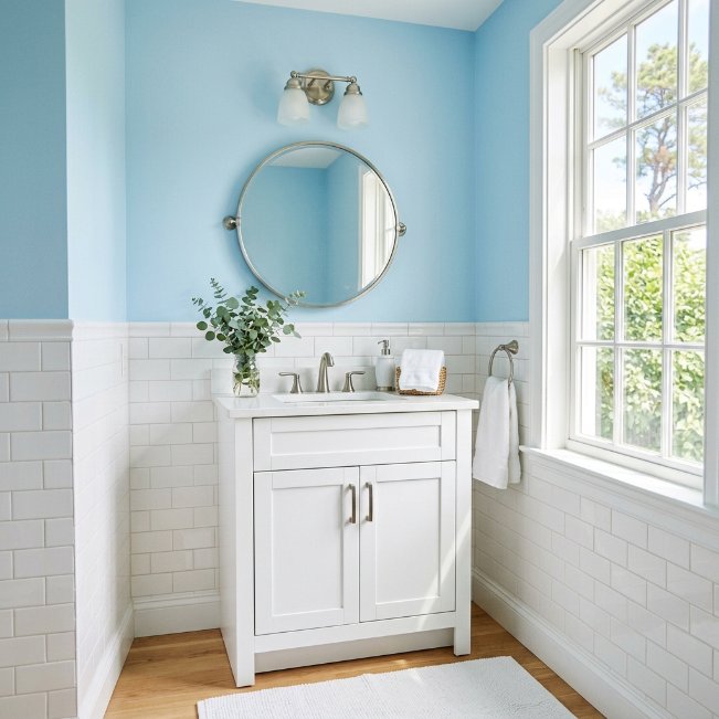
- Brightens small, dim bathrooms and makes them feel more open
- Creates a fresh, coastal feel without being overly themed
- Pairs naturally with white tile, nickel, and light wood tones
- Reflects both natural and artificial light exceptionally well
- Works well in bathrooms with limited windows or airflow
Light sky blue remains a go-to among light colors for small bathroom spaces because it visually expands the room rather than shrinking it. This shade reflects light beautifully, which matters most in bathrooms without much natural sunlight to work with throughout the day. In my experience, homeowners renovating small guest bathrooms or powder rooms gravitate toward this color specifically because it feels clean and refreshing without requiring bold commitment. It’s an easy, low-risk way to add color while keeping things bright.
Beyond its visual benefits, light sky blue also has a calming, spa-like effect that many people don’t expect from such a simple shade. Paired with white subway tile and brushed nickel fixtures, it creates a clean, coastal-inspired look that feels timeless rather than trendy. This combination shows up frequently across bathroom paint suggestions on Pinterest because it works in nearly any home style, from modern farmhouse to traditional, making it one of the safest bold-adjacent choices available.
Warm Greige Neutral
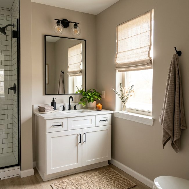
- Bridges the gap between warm and cool tones for easy pairing
- Works with almost any fixture finish, from brass to black
- Feels updated and current without leaning too trendy or bold
- Creates a calm, neutral backdrop that won’t compete with decor
- Popular resale-friendly choice that appeals to a wide range of buyers
Greige has become one of the most requested bathroom paint colors for small bathrooms because it solves the age-old debate between warm and cool tones. It’s technically neutral, but with enough warmth to avoid feeling sterile or overly grey. I’ve tried this shade in several small guest bathrooms, and it consistently reads as fresh and updated regardless of the existing tile or flooring. That flexibility is rare, since most neutral colors clash with either warm wood tones or cool stone surfaces.
This shade also works exceptionally well for anyone unsure about committing to a bolder color but still wanting something more interesting than plain white. It pairs naturally with black, brass, or nickel fixtures, which means homeowners don’t need to replace hardware to make the room feel cohesive. Greige shows up often in bathroom color schemes shared across Pinterest because it photographs consistently well in different lighting conditions, making it a dependable, low-risk choice for almost any bathroom style or layout.
Bold Black Accent
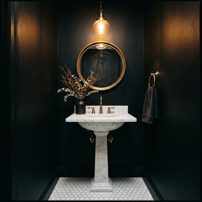
- Creates a dramatic, high-end look that feels custom designed
- Makes white fixtures, tile, and trim stand out sharply
- Works surprisingly well in small bathrooms with good lighting
- Pairs beautifully with brass, marble, and warm lighting fixtures
- Hides scuffs, fingerprints, and water spots better than any light shade
Black walls sound intimidating, but they’re quickly becoming one of the most searched painting ideas for bathroom spaces wanting serious visual impact. The key is balancing the darkness with enough warm lighting and light-colored fixtures so the room doesn’t feel like a cave. That’s why many designers recommend pairing black walls with brass hardware and marble accents, since the contrast creates depth rather than heaviness. Even compact bathrooms can pull this off successfully when natural or warm artificial light is present.
What surprises most homeowners is how practical black actually is for daily maintenance. It hides water spots, soap scum, and fingerprints far better than white or pastel walls ever could. This makes it a smart choice for busy bathrooms, not just a bold design statement. Black bathrooms consistently perform well on Pinterest because they photograph dramatically under the right lighting, giving the space a boutique, editorial feel that few other colors can replicate so effectively.
Pale Yellow Glow
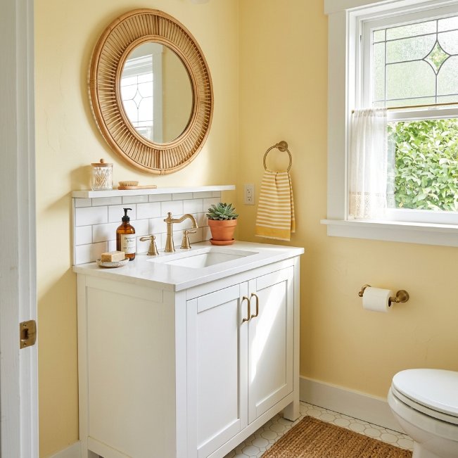
- Adds a cheerful, energizing feel first thing in the morning
- Brightens small or windowless bathrooms with a sunny glow
- Pairs naturally with white tile, rattan, and brass accents
- Works well in guest bathrooms and powder rooms especially
- Feels nostalgic and warm without looking dated or childish
Pale yellow is an underrated pick among bathroom color suggestions for anyone wanting a cheerful start to their morning routine. Unlike brighter, more saturated yellows, a soft buttery tone feels warm and welcoming rather than overwhelming or harsh under bathroom lighting. I’ve noticed this shade performs especially well in bathrooms without windows, since it visually mimics natural sunlight even under artificial bulbs. That small trick alone can make a windowless powder room feel far more inviting than expected.
This color also carries a nostalgic, cottage-like charm that pairs beautifully with rattan, brass, and simple white tile. It’s playful without feeling immature, which makes it suitable for both kids’ bathrooms and adult guest spaces alike. Pale yellow bathrooms tend to stand out on Pinterest precisely because they’re less common than blues, greens, or neutrals. That rarity, combined with its cheerful warmth, makes it a memorable and genuinely mood-boosting choice for small spaces.
Dusty Mauve Shade
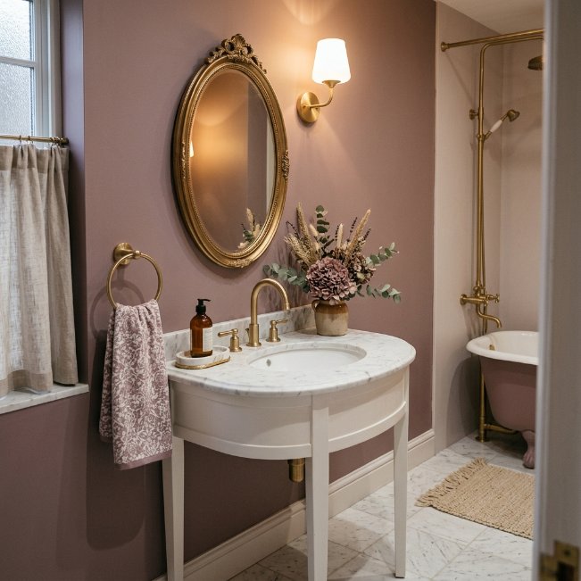
- Adds warmth and depth without feeling overly bold or trendy
- Pairs beautifully with gold, brass, and soft white accents
- Works well in both modern and traditional bathroom styles
- Creates a cozy, romantic feel that still reads as sophisticated
- Flatters skin tones better than cooler pink or grey shades
Dusty mauve sits comfortably among the best color for bathroom walls when someone wants warmth without committing to a fully pink or purple space. This muted, greyed-down tone reads as elegant rather than sweet, which is why it works so well in adult bathrooms and primary ensuites. I’ve seen this work well in many homes where homeowners wanted personality but were nervous about anything too saturated. Mauve offers that middle ground, adding richness while still feeling calm and livable day after day.
What makes this shade particularly special is how it shifts subtly throughout the day, appearing more pink in morning light and deeper in the evening. That dynamic quality keeps the space feeling alive rather than flat or one-dimensional. Paired with gold fixtures and marble surfaces, dusty mauve creates a boutique-hotel atmosphere that photographs beautifully for Pinterest. It’s a sophisticated choice for anyone wanting their bathroom to feel intentional, warm, and quietly luxurious without excessive effort.
Crisp Mint Green
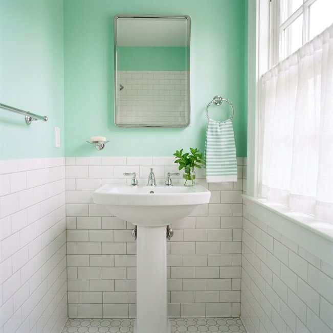
- Adds a fresh, retro-inspired charm that feels nostalgic yet current
- Brightens small bathrooms with a crisp, clean visual effect
- Pairs naturally with chrome, white tile, and simple fixtures
- Works especially well in guest bathrooms and kids’ spaces
- Feels playful without sacrificing a clean, put-together look
Crisp mint green brings a playful, retro-inspired energy to small bathroom paint color ideas without tipping into anything too juvenile or dated. This shade works because it walks a fine line between fresh and classic, drawing inspiration from mid-century bathrooms while still feeling relevant today. In my experience, mint performs particularly well in bathrooms with chrome or nickel fixtures, since the cooler metal tones complement the color’s crispness rather than competing with its warmth the way brass sometimes can.
This color also has a naturally uplifting, clean effect that makes small bathrooms feel more spacious and cheerful. It’s an easy way to introduce personality into a guest bathroom or kids’ space without committing to something overly themed or trendy. Mint green bathrooms consistently gain traction on Pinterest because they photograph beautifully in natural light, and the color pairs effortlessly with simple white tile, giving the space a timeless, slightly nostalgic charm that feels genuinely refreshing.
Rich Chocolate Brown
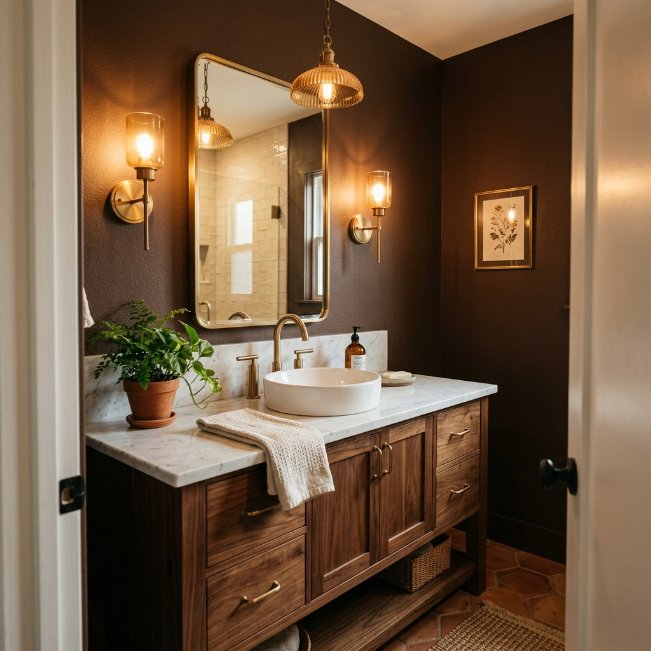
- Creates a warm, cocooning feel that suits colder climates well
- Pairs beautifully with brass, marble, and natural wood tones
- Hides water marks and daily wear better than lighter shades
- Adds sophistication and depth without feeling overly dark or heavy
- Works especially well in primary bathrooms and ensuites
Rich chocolate brown has quietly become one of the most searched bathroom paint colors for homeowners chasing warmth over the typical cool, spa-inspired palette. It’s a bold departure from the greys and whites that dominated bathroom design for years, offering something cozier and more grounded instead. That’s why many designers recommend brown for primary bathrooms specifically, since it creates an intimate, retreat-like atmosphere perfect for unwinding at the end of a long day rather than a clinical, hotel-like feel.
Paired with brass fixtures and natural wood accents, chocolate brown creates a rich, layered look that feels both current and timeless simultaneously. It’s especially forgiving in bathrooms that see heavy daily use, since it hides water spots, scuffs, and general wear far better than lighter paint colors ever could. This shade has been gaining serious momentum on Pinterest as homeowners move away from stark minimalism toward warmer, more personality-driven spaces that feel genuinely lived in and loved.
Pale Aqua Wash
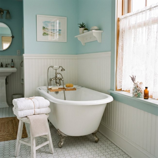
- Creates a relaxed, coastal feel without a heavy beach theme
- Brightens small bathrooms while adding a soft touch of color
- Pairs naturally with white beadboard, nickel, and cotton textures
- Works well in bathrooms with clawfoot tubs or vintage details
- Feels calming and gentle, ideal for unwinding after a long day
Pale aqua is one of those quietly effective small bathroom paint color ideas that never seems to go out of style. It carries just enough color to feel intentional without overwhelming a compact space, which makes it especially popular for guest bathrooms and older homes with vintage fixtures. I’ve noticed this shade pairs particularly well with beadboard trim, since the combination softens the room and adds texture without requiring a full renovation or expensive material upgrade.
Beyond its visual charm, pale aqua has a genuinely calming psychological effect that suits bathrooms meant for relaxing baths or quiet morning routines. It reflects natural light beautifully, making even north-facing bathrooms feel brighter and more welcoming throughout the day. This color continues to perform well across Pinterest boards focused on coastal and cottage-style interiors, largely because it feels timeless rather than trend-driven, giving homeowners a reliable, soft color choice that ages gracefully over many years.
Deep Plum Wall
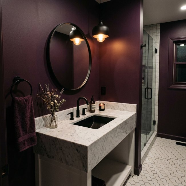
- Adds bold, jewel-toned drama that feels custom and luxurious
- Pairs beautifully with black, brass, or nickel fixtures
- Creates an intimate, moody atmosphere perfect for evening routines
- Works well in powder rooms and primary ensuites alike
- Hides scuffs and daily wear better than lighter paint shades
Deep plum belongs in the same conversation as navy and forest green when discussing the best paint colors for bathrooms seeking real drama. It’s a jewel tone that feels luxurious without being overly feminine, making it a versatile choice for shared bathrooms or primary ensuites alike. That’s why many designers recommend plum for spaces used mostly in the evening, since warm lighting deepens the color beautifully, creating an intimate, almost velvet-like richness that photographs exceptionally well for design inspiration boards.
This shade also solves a common small-bathroom problem: making a compact space feel intentional rather than cramped. Deep, saturated colors like plum create a cocooning effect that reads as a deliberate design choice instead of a limitation. Paired with marble, black fixtures, or brass accents, the room feels custom-designed and expensive. Plum bathrooms consistently gain traction on Pinterest because they stand out among the sea of neutral, safe color choices most homeowners default to.
Soft Butter Cream
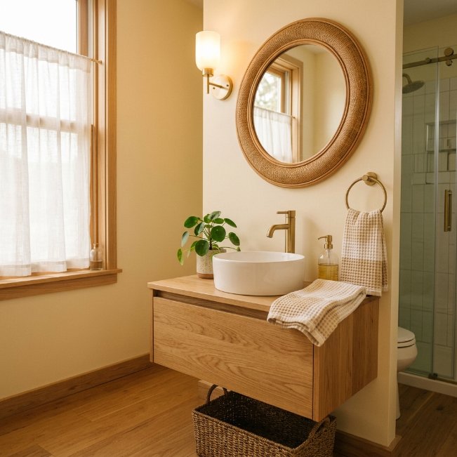
- Adds warmth without feeling as bold as a full yellow wall
- Brightens dim bathrooms with a soft, golden undertone
- Pairs effortlessly with wood, rattan, and brass finishes
- Feels timeless and cozy rather than trendy or seasonal
- Works well for those wanting warmth without strong commitment
Soft butter cream ranks among the best bathroom colors for homeowners who love the warmth of yellow but want something more subtle and easier to live with long term. This muted, creamy tone avoids the boldness of a true yellow while still delivering that same golden, sunlit feeling throughout the day. In my experience, this shade works wonderfully in bathrooms that lack strong natural light, since it visually warms up the space even under standard bulb lighting or overcast conditions.
Its versatility is what makes it so popular, pairing effortlessly with natural wood, rattan, and brass without clashing with existing warm-toned finishes many homes already have. Butter cream feels neither overly modern nor outdated, sitting in that rare timeless category most trendy colors fail to reach. Pinterest boards centered on warm, cozy bathroom aesthetics frequently feature this shade because it delivers a soft glow that feels inviting, comfortable, and genuinely liveable for busy households.
Cool Slate Grey
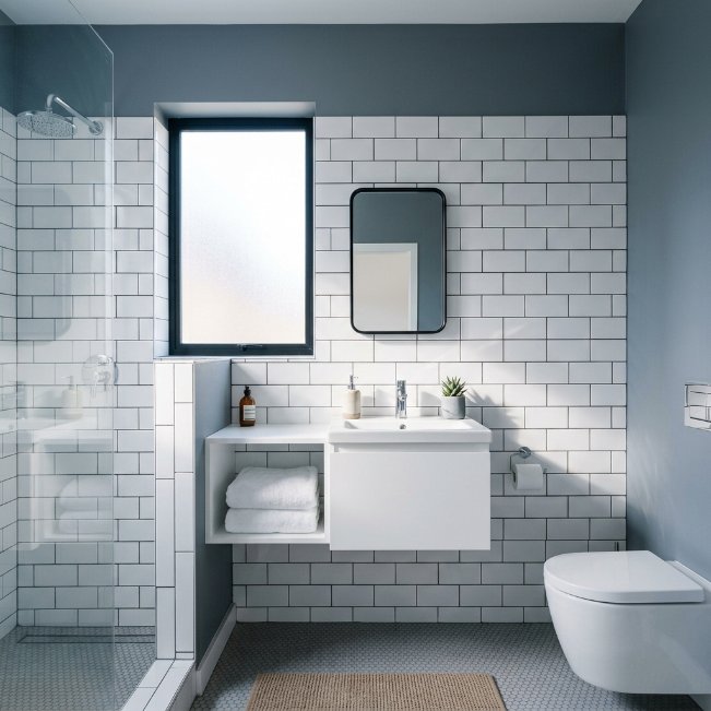
- Creates a clean, modern look that feels calm and put-together
- Pairs naturally with chrome, white tile, and simple hardware
- Works especially well in bathrooms with strong natural light
- Hides water spots and daily grime better than pure white
- Feels sophisticated without leaning too dark or dramatic
Cool slate grey remains a dependable pick among small bathroom paint colors for homeowners wanting a modern, spa-like feel without much risk involved. Unlike warmer greiges, this shade leans crisp and clean, making it especially suited to bathrooms with plenty of natural light or cooler-toned fixtures like chrome and nickel. I’ve tried this color in bathrooms with strong afternoon sun, and it consistently reads as fresh rather than cold, which is a common concern homeowners have before committing to grey walls.
This shade also does an excellent job of hiding everyday wear, from water spots on the vanity wall to light scuffing near the shower. That practicality matters in bathrooms that see heavy daily traffic from a full household. Slate grey pairs beautifully with white subway tile and floating vanities, a combination that shows up constantly across modern bathroom inspiration on Pinterest. It’s a safe yet stylish choice that photographs well and rarely feels like it needs updating anytime soon.
Warm Peach Blush
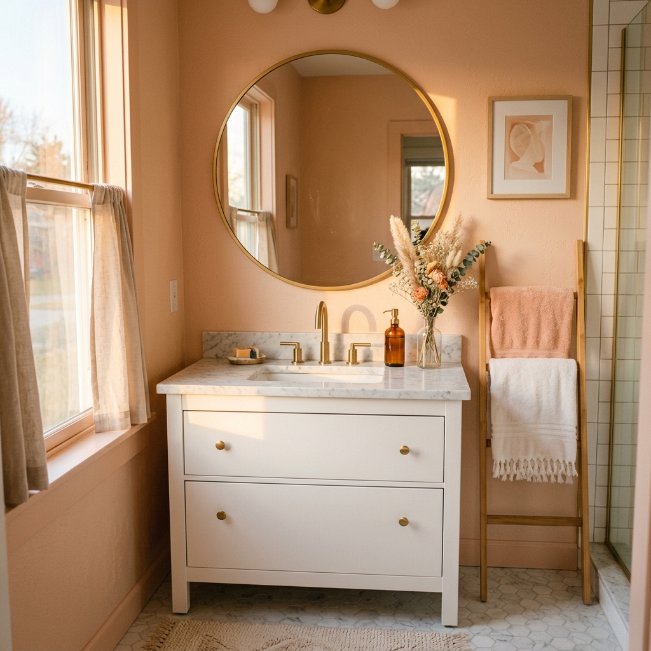
- Adds a warm, flattering glow that feels inviting and cozy
- Pairs beautifully with gold, brass, and marble finishes
- Brightens small bathrooms without feeling stark or clinical
- Works especially well in powder rooms and guest bathrooms
- Feels romantic and soft without being overly sweet or trendy
Warm peach blush has been gaining popularity among bathroom paint suggestions for anyone wanting a color that feels genuinely warm rather than simply light or neutral. This shade sits between pink and orange, creating a golden, sun-kissed glow that flatters the room throughout the day. That’s why many designers recommend peach for bathrooms lacking strong natural light, since the undertone mimics warm sunlight even during grey, overcast days, making the space feel consistently inviting no matter the season.
This color also plays beautifully with gold and brass fixtures, creating a cohesive, warm palette that feels intentional rather than mismatched. Marble countertops enhance the glow even further, giving the room a soft, romantic quality without tipping into anything overly precious or themed. Peach blush bathrooms have been showing up more frequently on Pinterest as homeowners move away from cold, all-white spaces toward warmer, more personality-filled rooms that genuinely feel good to spend time in daily.
Classic Hunter Green
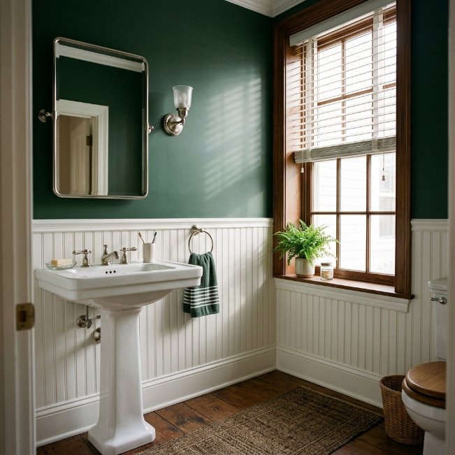
- Adds a refined, traditional feel that suits classic home styles
- Pairs naturally with nickel, white beadboard, and wood trim
- Works well in bathrooms wanting a masculine or gender-neutral look
- Creates depth and richness without feeling overly trendy
- Hides daily wear better than lighter, more delicate paint shades
Hunter green offers a more traditional take on the deep green trend, making it one of the more versatile bathroom color ideas for homeowners who prefer classic over contemporary styling. It reads as timeless rather than trendy, which explains why it’s remained a steady favorite in both older homes and new builds alike. I’ve noticed this shade works particularly well paired with white beadboard, since the traditional trim detail balances the richness of the wall color without feeling overly formal or dated.
This color also tends to suit gender-neutral bathrooms exceptionally well, making it a smart choice for shared family spaces or guest bathrooms used by a variety of people. Paired with nickel fixtures and natural wood accents, hunter green creates a grounded, refined look that feels effortlessly put-together. It continues to appear across traditional and transitional bathroom boards on Pinterest, offering homeowners a reliable way to add depth and sophistication without straying into anything too bold or short-lived.
Icy Powder Blue
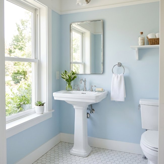
- Creates an airy, spacious feeling in the smallest of bathrooms
- Pairs naturally with chrome, white tile, and simple hardware
- Reflects light exceptionally well, brightening darker corners of the room
- Feels crisp and clean without veering into cold or sterile territory
- Works well for classic, timeless bathroom styles of any era
Icy powder blue continues to be one of the most reliable light colors for small bathroom spaces because it genuinely makes rooms feel bigger than they are. This pale, almost whisper-soft blue reflects natural light beautifully, bouncing brightness into corners that darker colors would otherwise swallow up. I’ve seen this work well in many homes with only one small window, where the color helps compensate for limited daylight by keeping the entire room feeling open, fresh, and far more spacious than its actual square footage suggests.
Its classic appeal also means powder blue rarely feels dated, unlike some trendier pastel shades that come and go quickly. Paired with white tile and chrome fixtures, it creates a clean, timeless look that suits nearly any home style, from traditional to modern farmhouse. This combination remains a consistent favorite across Pinterest’s bathroom color ideas boards, largely because it delivers a fresh, put-together look without requiring bold commitment or extensive renovation work to achieve the desired result.
Rich Terracotta Clay
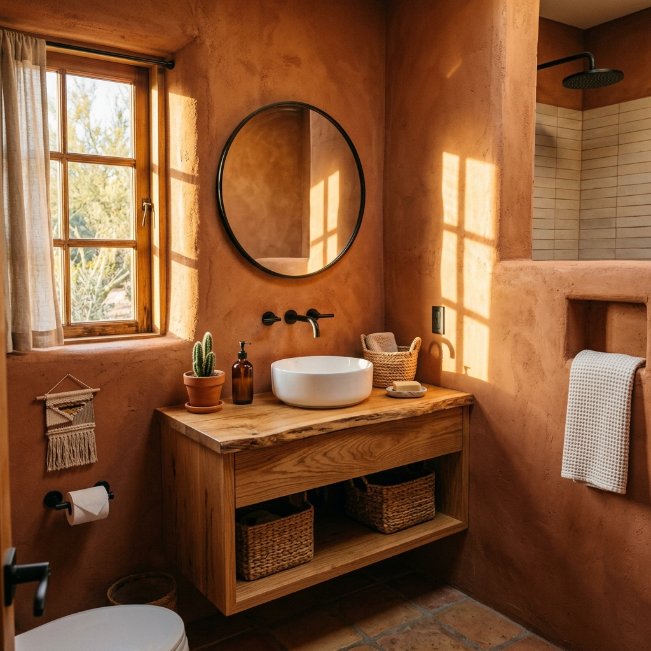
- Adds bold, earthy warmth inspired by Southwestern design trends
- Pairs beautifully with black fixtures, natural wood, and woven textures
- Creates a cozy, sun-washed glow even in artificial lighting
- Works especially well in bathrooms with warm wood flooring
- Feels distinctive and memorable without being difficult to pair
Rich terracotta clay takes the popular accent wall concept a step further by covering the entire room in warmth, making it one of the boldest bathroom color schemes gaining traction right now. This deep, earthy shade draws from Southwestern and Mediterranean design influences, delivering a sun-washed glow that feels grounded and inviting rather than overwhelming. That’s why many designers recommend pairing it with natural materials like wood, rattan, and woven baskets, since these textures echo the color’s organic, handcrafted feel throughout the space.
What makes full terracotta rooms so striking is their ability to feel warm and cohesive rather than busy or overdone, especially when black fixtures provide sharp, grounding contrast against the clay-toned walls. This combination has been steadily climbing in popularity across Pinterest, appealing to homeowners who want their bathroom to feel distinctly different from the typical white-and-grey palette. It’s a confident, memorable choice that photographs beautifully and instantly gives small spaces a sense of intentional, well-traveled character.
Timeless Ivory White
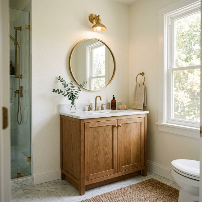
- Creates a bright, timeless backdrop that suits any bathroom style
- Pairs effortlessly with wood, brass, marble, and neutral textures
- Feels warmer and softer than stark, cool-toned white paint
- Works as a safe, universally appealing choice for resale value
- Makes small bathrooms feel brighter, larger, and more open overall
Ivory white closes out this list as one of the most dependable neutral bathroom paint colors available, and for good reason. It offers all the brightness of white without the clinical, cold feeling that pure white can sometimes create under bathroom lighting. In my experience, ivory tends to be the safest recommendation for anyone unsure about committing to color, since it still feels warm, soft, and inviting while remaining flexible enough to pair with virtually any fixture finish or decor style down the road.
This shade has remained a steady favorite because it never really goes out of style, unlike more saturated trend colors that eventually feel dated. Paired with brass fixtures, natural wood, or marble surfaces, ivory white creates a soft, elevated look that photographs beautifully for Pinterest inspiration boards. It’s a dependable choice for anyone wanting brightness and warmth without sacrificing flexibility, making it a fitting close to any list of bathroom paint ideas built for real, everyday homes.
Conclusion:
Choosing the right color doesn’t have to feel overwhelming. These bathroom paint ideas prove that even the smallest space can feel intentional, warm, and completely transformed with the right shade on the walls. I’ve seen how small changes like these can completely shift the mood of a room, often for the cost of a single paint can. Pick the direction that speaks to you, grab a sample, and see how it feels in your own light before committing. Save this post for your next project, share it with a friend who’s planning a refresh, and remember that great design often starts with something this simple.