
20 Chic Wall Decor Ideas for a Dreamy Living Room
Introduction:
Staring at a blank living room wall, wondering what’s missing? You’re not alone. It’s one of the most common design struggles, and honestly, one of the easiest to fix. These wall decor ideas for living room spaces are here to turn that empty stretch into the part of your home guests actually notice.
In my experience, most people don’t need more furniture or a full renovation. They need the right idea for the wall they already have. Whether you’re working with a tiny apartment corner, a big open-concept space, or an awkward spot above the TV, there’s a version of these ideas that fits. I’ve seen simple changes, like leaning a mirror or adding one bold print, completely shift how a room feels. This list covers something for every style, budget, and skill level, from renter-friendly options to bigger design commitments worth planning around.
Gallery Wall Above Sofa

- Instantly fills empty space above the couch without needing one giant piece
- Mixes photos, prints, and small art for a collected-over-time feel
- Works with almost any style, from modern to boho
- Easy to rearrange or add to as your taste evolves
- Great way to display family photos without cluttering shelves
A gallery wall is one of those wall decor ideas for living room spaces that never really goes out of style. In my experience, the trick is spacing, not perfection. Leave 2–3 inches between frames and keep the whole arrangement roughly 6–8 inches above the sofa back. You don’t need matching frames either. A mix of textures and finishes actually looks more intentional than a uniform set. Start with a paper template on the floor before hammering a single nail, and you’ll avoid the most common gallery wall mistake: crowding.
The real magic happens once you start layering sizes. A large anchor piece in the center, flanked by smaller prints and one or two photos, creates natural visual movement across the wall. I’ve noticed homeowners often stop at symmetry and miss the chance to tell a story with their layout. Group by color palette instead of size alone, and the whole wall reads as cohesive rather than random. This approach also makes it simple to swap pieces seasonally without redoing the entire display.
Oversized Statement Art
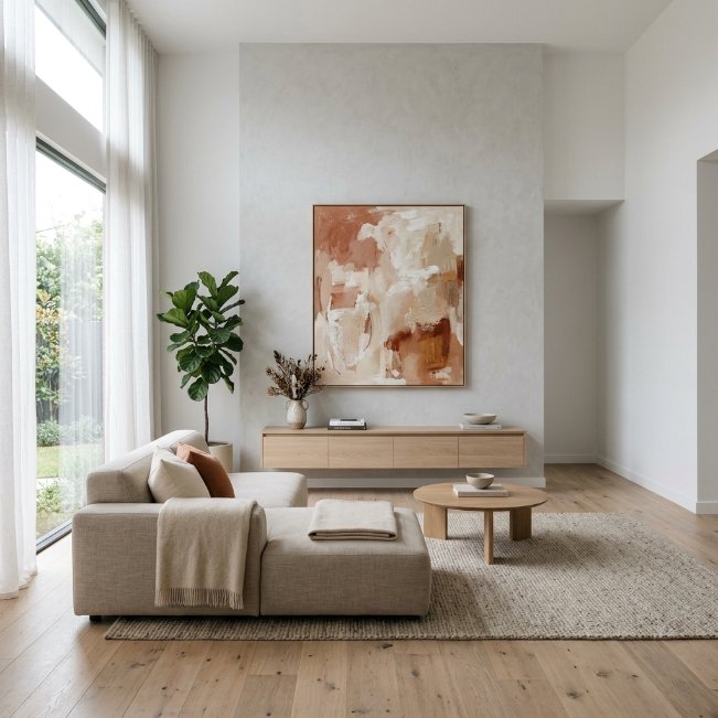
- One large piece can replace the need for multiple smaller items
- Creates an instant focal point without visual clutter
- Best choice for large wall decor ideas for living room layouts with high ceilings
- Simplifies decorating decisions since there’s only one piece to choose
- Draws the eye upward, making rooms feel taller and more open
Oversized art solves a problem many people don’t realize they have: an empty wall that feels unfinished no matter what small pieces they try. A single large-scale piece, ideally two-thirds the width of your sofa, gives the whole room a sense of intention and calm. It works especially well in modern or minimalist spaces where too many small accents can feel busy. Choose a piece with colors that echo something already in the room, like a cushion or rug, so it feels connected rather than randomly placed against the wall.
That’s why many designers recommend going bigger than feels comfortable when shopping for statement art. A piece that seems oversized in the store often looks just right once it’s mounted at eye level in a full room. Canvas prints, framed textile art, or even an abstract tapestry all work here. The goal isn’t complexity, it’s presence. One confident piece, properly scaled, does more visual work than five small frames scattered across the same amount of wall space.
TV Wall Integration
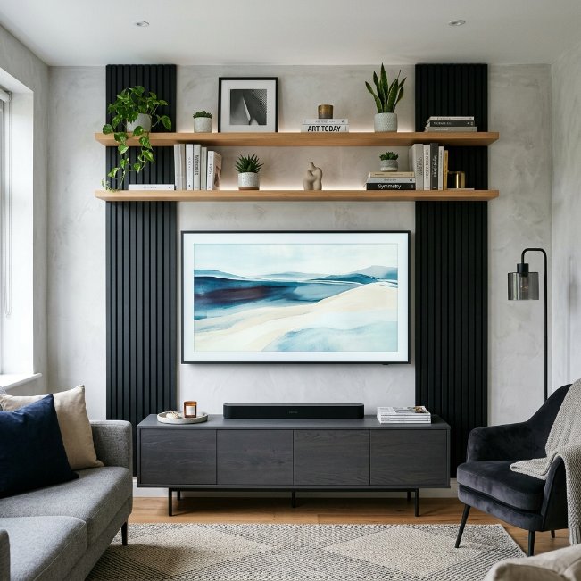
- Blends the TV into the design instead of leaving it as a lone black rectangle
- Adds storage and display space around the screen
- A go-to among wall decor ideas for living room with tv setups
- Balances technology with warmth using plants, books, or art
- Hides cords and cables for a cleaner finished look
Decorating around a television used to mean choosing between a stark screen or a cluttered entertainment center, but that’s changed. Framing the TV with floating shelves, a slim console, or symmetrical wall panels turns it into part of the design rather than an interruption. Adding a few plants, books, or small art pieces on either side softens the tech-heavy focal point. In my experience, even simple additions like a woven basket or a small sculpture nearby can make the whole wall feel curated instead of accidental.
Cable management makes or breaks this look, and it’s worth doing properly. A cord cover or in-wall channel keeps the space looking intentional rather than tangled. I’ve seen this work well in many homes: mounting the TV slightly lower than expected, closer to eye level when seated, then building the shelving and art around that height. The result feels balanced rather than like the screen was simply hung and left to dominate the wall on its own.
Mirror Wall Feature
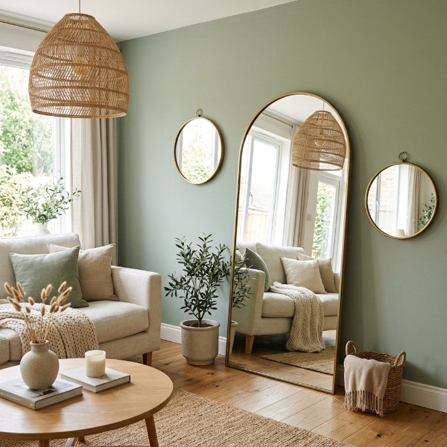
- Bounces natural light around the room, making it feel brighter
- Adds depth and makes smaller living rooms feel more spacious
- One of the most versatile mirror wall decor ideas for living room spaces
- Works as a solo statement piece or grouped in odd numbers
- Reflects a view or window to double the visual interest
Mirrors do double duty on a living room wall, and that’s exactly why they’re such a popular pick. Beyond the obvious styling benefit, a well-placed mirror reflects light from windows or lamps, making the entire room feel brighter without adding a single extra fixture. An arched or round shape softens a space filled with straight furniture lines, while a large rectangular mirror leaning against the wall creates a relaxed, collected look. Position it across from a window for the best light-bouncing effect, and the difference is noticeable within days.
I’ve noticed that people often default to one small mirror and stop there, missing a much better option. Grouping three mirrors of varying sizes, or choosing one oversized piece, creates far more visual impact than a single modest one ever could. That’s why many designers recommend leaning a large mirror against the wall instead of hanging it, especially in rooms with lower ceilings. It adds a relaxed, editorial feel while still delivering all the light-enhancing benefits a mirror brings to the space.
Woven Wall Hangings
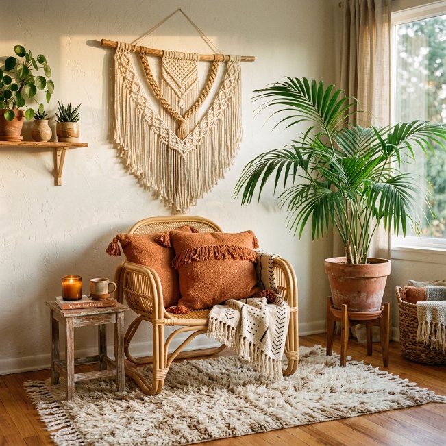
- Adds texture and warmth without needing color or pattern
- A signature choice among wall decor ideas for living room boho styling
- Softens hard architectural lines like exposed brick or concrete
- Brings a handmade, artisanal feel to the space
- Pairs well with plants and natural fiber furniture
Texture is often the missing ingredient in living rooms that feel flat, and woven wall hangings fix that instantly. Macramé, woven tapestries, or fiber art bring dimension to a plain wall in a way that flat art simply can’t. They work beautifully in boho, coastal, or organic modern spaces, softening the room with natural materials like jute, cotton, and wood beading. Even a single medium-sized piece above a reading chair or side table can shift the whole mood of a corner from empty to inviting.
I’ve tried pairing woven hangings with both neutral and bold walls, and the neutral backdrop almost always wins. The texture itself becomes the star, so a busy or dark wall color tends to compete rather than complement. Layering a few plants nearby, like a trailing pothos or a tall palm, echoes the organic feel and ties the whole area together. This idea works especially well for renters too, since most hangings mount with a single hook and leave no lasting damage to the wall.
Floating Shelf Display
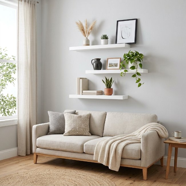
- Combines storage and decoration in one functional layout
- A practical pick among wall decor ideas for living room minimal styling
- Lets you rotate and update decor without new holes in the wall
- Displays books, plants, and photos at varying heights
- Keeps surfaces below clear, which makes the whole room feel tidier
Floating shelves solve a problem that framed art alone can’t: they give you somewhere to actually place things. A staggered arrangement of two or three shelves at varying heights creates visual rhythm while offering real display space for plants, candles, or a small stack of books. Unlike a single large art piece, shelves let you change the styling seasonally or whenever the mood strikes, which keeps the wall feeling fresh. Keeping each shelf to just three or four items avoids a cluttered, overstuffed look.
In my experience, the biggest mistake with floating shelves is filling every inch of them. Negative space is what makes the styling look curated rather than crammed. Leave visible gaps between objects, vary the heights of what you place, and lean one or two small frames instead of hanging everything flat. This idea works particularly well in minimal or Scandinavian-inspired rooms, where the goal is a calm, uncluttered wall that still feels personal and lived-in rather than sparse.
Framed Photo Collage

- Turns everyday memories into a polished design feature
- A classic pick among wall decor ideas for living room photo collages black and white aesthetic layouts
- Grid layouts feel more structured than scattered gallery walls
- Easy to update by swapping photos without changing frames
- Creates a personal, meaningful focal point guests always notice
A photo collage wall brings something no store-bought art ever can: real memories that mean something to the people living in the room. Converting favorite photos to black and white before framing instantly ties mismatched images together into one cohesive look, even if they were taken years apart. A tight grid, three across and three down for example, gives the display a clean, gallery-quality structure rather than a scattered, casual feel. This idea works particularly well above a console table or sofa where the collage becomes the natural focal point of the entire room.
I’ve seen this work well in many homes with growing families, since the grid format makes it simple to swap one photo without redoing the whole layout. Consistent frame color and matting are what make the difference between looking curated and looking cluttered. Choose one frame style, whether that’s matte black, white, or natural wood, and stick with it throughout. That single decision does more to elevate the finished wall than any individual photo choice within the collage itself.
Above-Couch Family Photos
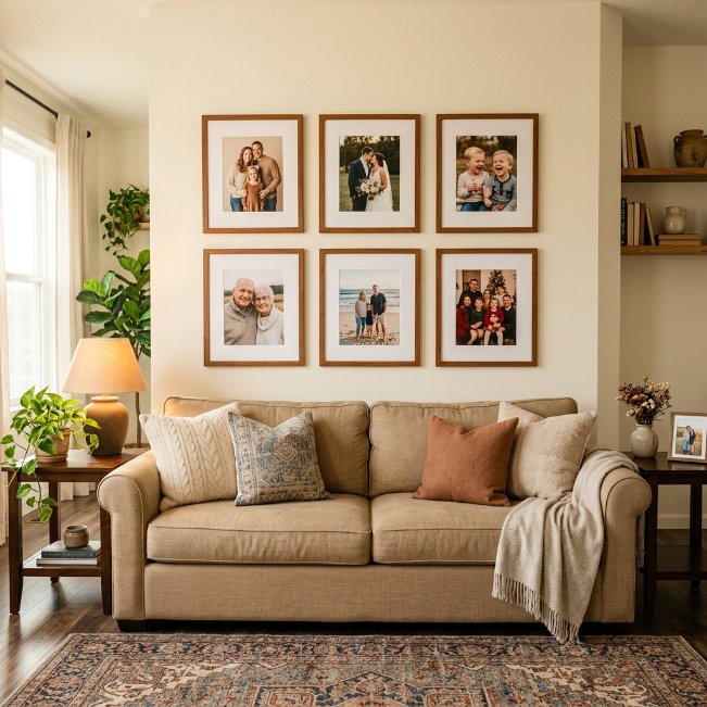
- Personalizes the space in a way generic art can’t replicate
- A go-to layout among modern living room wall decor ideas above couch family photos
- Symmetrical grids feel structured and intentional above furniture
- Works well in traditional, transitional, and modern farmhouse styles
- Adds warmth and a lived-in feeling to formal living rooms
Placing family photos directly above the couch is one of those wall decor ideas for living room spaces that instantly makes a house feel like a home. A symmetrical layout, centered to the width of the sofa, gives the arrangement a formal, put-together look that still feels warm and personal. Keeping frames uniform in color and style, while allowing photo sizes to vary slightly, adds interest without looking chaotic. This works especially well in family or living rooms where guests naturally gather and spend time facing the sofa.
That’s why many designers recommend hanging this display at a specific height: roughly 6 to 8 inches above the sofa back, so it feels connected to the furniture rather than floating separately near the ceiling. I’ve noticed families often hang photos too high, leaving an awkward gap that throws off the whole room’s balance. A helpful trick is holding a photo at chest height while standing before committing to a nail, since it mimics eye level much more accurately than guessing from across the room.
Coastal Wall Vignette
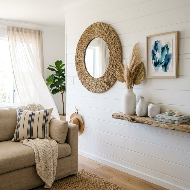
- Brings a relaxed, beachy feel without full coastal-themed furniture
- A signature layout among coastal wall decor ideas for living room styling
- Mixes texture, like woven and driftwood elements, with soft color
- Works well in rooms with lots of natural light
- Keeps the palette light so the space feels open and calm
A coastal wall vignette doesn’t require blue and white stripes or anchor motifs to feel like the beach lives in your living room. Instead, it leans on texture and light: woven seagrass, driftwood, and soft ceramic pieces layered together on one wall. Pairing a textural mirror with a small abstract art piece in muted ocean tones creates depth without overwhelming the space. This approach works particularly well in rooms that already get plenty of natural light, since the airy palette reflects and amplifies it rather than competing with it.
In my experience, the key to a coastal look that doesn’t feel themed or costume-like is restraint. Choose two or three natural materials, like rattan, driftwood, and linen, and repeat them rather than adding every coastal object available. A single vase or piece of art in a soft blue or sandy tone is usually enough color. Keeping the rest of the wall neutral lets the texture do the work, giving the space a relaxed, sun-washed feeling year-round.
Vertical Art Arrangement
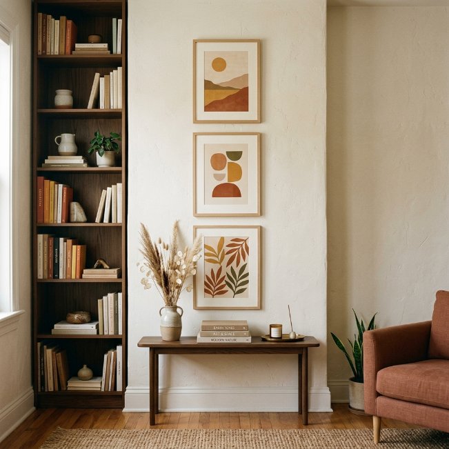
- Draws the eye upward, making low ceilings feel taller
- Perfect for narrow or awkward wall spaces beside furniture
- A smart solution for empty wall decor ideas for living room corners
- Uses vertical space efficiently without needing a wide wall
- Adds visual height that balances low or wide furniture pieces
A vertical arrangement solves a very specific problem: what to do with a narrow strip of wall that feels too small for a normal gallery layout. Stacking two or three frames directly on top of each other, rather than side by side, draws the eye upward and makes the entire room feel taller in the process. This works particularly well next to a bookshelf, doorway, or window, where horizontal space is limited but vertical space goes unused. Choosing frames with a consistent width keeps the stack looking intentional rather than randomly assembled.
I’ve noticed this idea gets overlooked because people assume decor needs a wide, open wall to make an impact. That’s simply not true. A tall, narrow arrangement can carry just as much visual weight as a large horizontal piece, especially in transitional spaces like hallway-adjacent living rooms. Leave consistent spacing between each frame, roughly 2 to 3 inches, and center the whole stack at eye level for the middle piece. The result reads as polished rather than like an afterthought squeezed into a leftover space.
Large Abstract Canvas

- Fills large wall space with one confident, cohesive piece
- A leading choice among modern large wall decor ideas for living room settings
- Adds color and mood without needing patterned furniture
- Simplifies styling since the art does most of the visual work
- Suits open-concept spaces that need a strong anchor point
An oversized abstract canvas works best in rooms with genuine scale, like open-concept living areas or spaces with high ceilings that swallow up smaller decor. The scale itself is the point. Rather than filling a large wall with several smaller pieces that can look scattered from across the room, one bold canvas anchors the entire space instantly. Rust, charcoal, and cream tones tend to work well because they read as sophisticated without locking the room into a specific trend that will feel dated within a few years.
That’s why many designers recommend measuring twice before buying abstract art at this scale, since returns on oversized canvases are often difficult or costly. Stand where the sofa will be and visualize the piece at roughly two-thirds the width of the seating area below it. I’ve seen this work well in many open floor plans, where the canvas becomes a visual anchor that ties the living room to an adjacent dining or kitchen space without needing matching decor throughout.
Layered Frame Leaning

- Creates a relaxed, collected-over-time look instead of a formal hang
- No nails or wall damage, ideal for renters
- A flexible layout among wall decor ideas for living room photo styling
- Easy to rearrange or swap pieces whenever the mood changes
- Adds depth through layering rather than a flat, single hung piece
Leaning frames instead of hanging them might be the lowest-effort, highest-impact styling trick in this entire list. Simply propping three different-sized pieces against the wall, slightly overlapping, behind a console table or on a floating shelf creates an effortless, editorial look that feels curated rather than fussy. It also solves a very practical problem for renters or anyone hesitant to put more holes in the wall. The slight imperfection of leaning art, rather than perfectly aligned hanging pieces, is actually what gives this layout its relaxed, lived-in charm.
In my experience, the trick to leaning frames well is varying both size and depth. Place the largest piece at the back, a medium one slightly in front and to one side, and a small object like a framed photo or small mirror tucked in front of that. This creates layers the eye can travel through rather than a flat wall of art. It’s a favorite among stylists precisely because it looks effortless while still being fully intentional in its arrangement.
Round Mirror Cluster
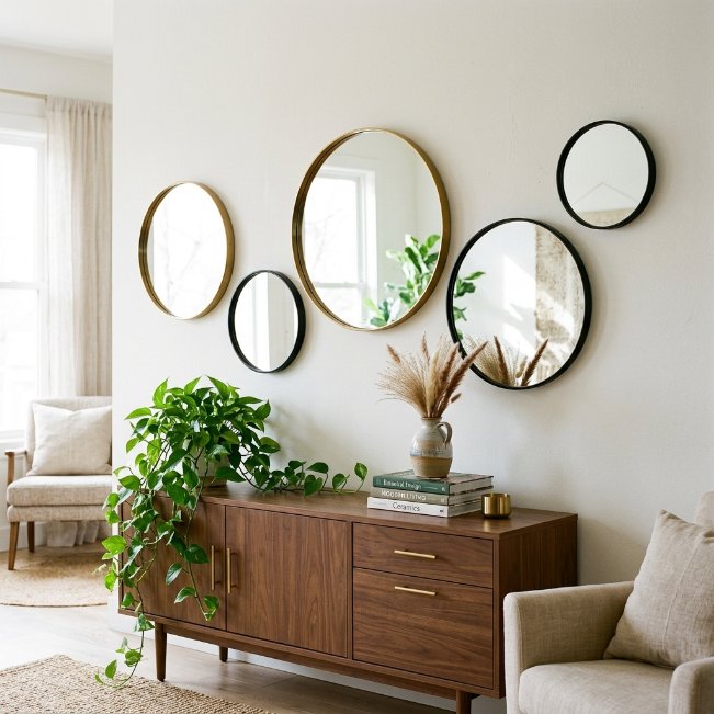
- Multiplies light reflection more than a single mirror can
- A striking take on living room wall mirror decor ideas above couch or console setups
- Mixing metal finishes adds visual interest without clashing
- Asymmetrical clusters feel more dynamic than a matched set
- Small mirrors are budget-friendly compared to one oversized piece
A cluster of round mirrors brings playfulness to a wall that a single mirror simply can’t achieve on its own. Varying the sizes, from a small 12-inch circle to a larger 24-inch piece, creates rhythm across the wall while still keeping the shapes consistent enough to feel unified. Mixing brass and black frames within the same cluster adds contrast without looking mismatched, especially against a light, neutral wall. This layout multiplies the light-bouncing benefit of mirrors too, since every angle catches and reflects a slightly different part of the room.
I’ve tried this layout in both small and large living rooms, and it consistently performs well in either setting. In smaller spaces, the reflected light and repeated circular shapes make the wall feel expansive rather than cramped. In larger rooms, the cluster becomes a striking focal point that doesn’t require a single expensive statement mirror. Arranging them asymmetrically, rather than in a perfect grid, gives the whole display a relaxed, gallery-like quality that feels considered instead of rigid.
Textured Accent Wall
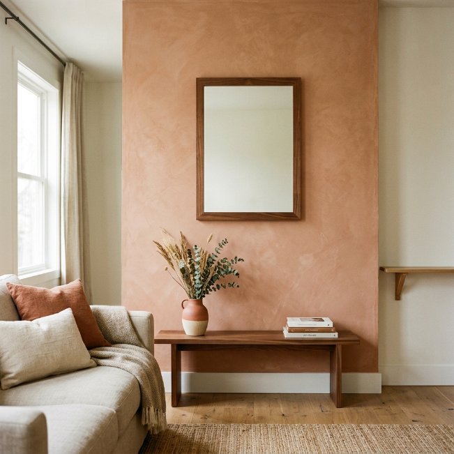
- Adds dimension using texture instead of relying on color or pattern
- A standout option among modern wall decor ideas for living room styling
- Works as a backdrop that makes minimal decor look intentional
- Limewash, plaster, or wood paneling all create tactile interest
- Requires less decor overall since the wall itself is the feature
A textured accent wall shifts the entire design approach, since the wall itself becomes the decor rather than just a backdrop for it. Limewash plaster, in particular, has become a favorite because it catches light differently throughout the day, creating subtle shadow and depth that flat paint never achieves. This technique works especially well in living rooms with minimal furniture, where the texture provides visual interest without needing additional art or accessories. A single wood-framed mirror or one small shelf is often all a textured wall needs to feel complete and finished.
That’s why many designers recommend starting with texture before adding art when a room feels flat despite having furniture and accessories already in place. I’ve seen this work well in many living rooms where owners had tried multiple gallery walls and statement pieces without success. The problem wasn’t the decor choices, it was a flat, uninteresting wall surface underneath everything. Once the texture went in, even sparse styling suddenly looked deliberate and elevated rather than unfinished or incomplete.
Plate Wall Arrangement

- Adds pattern and color using found or collected objects
- A unique, unexpected pick among wall decor ideas for living rooms
- Great way to repurpose vintage or inherited pieces
- Circular arrangements feel more organic than strict grids
- Brings personality and a sense of history into the space
Decorative plates on the wall might sound old-fashioned, but styled with a modern, loose arrangement, they bring a collected, storytelling quality that most mass-produced art can’t match. Mixing plate sizes and glazes, rather than using a matching set, gives the display an heirloom feel even with pieces bought secondhand. A loose circular or oval pattern feels more natural than a strict grid, echoing the organic shape of the plates themselves. This idea works particularly well near a dining area or kitchen-adjacent living space, where the theme feels connected to the room’s function.
In my experience, thrifted and vintage plates almost always look better together than a brand-new matching set from a single store. The slight variation in glaze, chip, and pattern is what gives the wall its character and warmth. Using plate hangers with adjustable spring backs makes installation simple, even for oddly shaped or antique pieces. This is one of those wall decor ideas for living room spaces that costs very little but consistently draws comments from anyone who visits and notices it.
Sculptural Wall Art
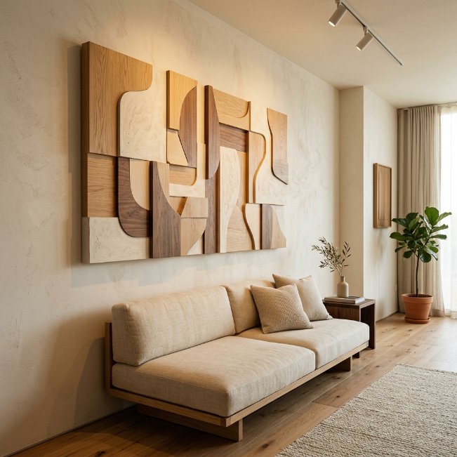
- Adds dimension and shadow play that flat art can’t create
- A refined pick among modern large wall decor ideas for living room spaces
- Works as a single statement piece with no additional decor needed
- Changes appearance throughout the day as light shifts
- Elevates a plain wall into a gallery-worthy focal point
Sculptural wall art brings something flat prints and paintings simply cannot: dimension that changes with the light throughout the day. A raised plaster or wood piece casts soft shadows in the morning that shift and deepen by evening, giving the wall a sense of movement even though nothing physically moves. This works especially well as a solo statement above a low-profile sofa, where the piece has enough breathing room to stand out without competing with other decor nearby. Neutral tones tend to work best, letting the texture itself carry the visual weight of the room.
I’ve noticed sculptural pieces intimidate people who assume they require an art background to choose well, but the opposite is usually true. A simple, organic shape in a neutral material almost always works, regardless of the room’s existing style. That’s why many designers recommend this option for clients who want a striking focal point without committing to a specific color palette. It pairs easily with anything from mid-century to modern farmhouse, since the interest comes from shape and shadow rather than color.
Boho Layered Textiles

- Combines multiple textures for a rich, collected look
- A signature layering technique among wall decor ideas for living room boho styles
- Mixing fringe, weave, and rattan adds depth without clutter
- Works well above low furniture like daybeds or floor seating
- Brings warmth and personality into minimally furnished rooms
Layering multiple textiles on one wall is a distinctly boho approach that trades symmetry for warmth and personality. A woven tapestry as the base layer, topped with a smaller rattan mirror and perhaps a fringed hanging slightly overlapping, creates a rich, collected feeling that no single piece could achieve alone. This works particularly well above lower furniture like a daybed or floor cushions, where the eye naturally travels upward across the layered textures. Sticking to a warm, earthy palette, think terracotta, cream, and rust, keeps the layers cohesive despite their different materials and shapes.
I’ve tried this approach in smaller apartments where a large piece of furniture wasn’t an option, and it consistently added more warmth per square foot than traditional framed art. The key is asymmetry. Placing pieces slightly off-center and at varying heights, rather than perfectly aligned, gives the wall an organic, gathered-over-time quality that feels authentic rather than styled overnight. Adding one trailing plant nearby completes the earthy, relaxed atmosphere this look is known for.
Minimalist Single Print

- Proves that one small piece can be enough
- A calming approach among wall decor ideas for living room minimal styles
- Leaves generous negative space for a peaceful, uncluttered feel
- Easy and affordable, requiring no complex arrangement
- Suits Scandinavian, Japandi, and modern minimal aesthetics
Sometimes the most effective wall decor idea is knowing when to stop, and a single small print does exactly that. Centered above a low sofa with generous empty space around it, one modest piece can carry an entire wall when the rest of the room stays calm and uncluttered. This approach suits Scandinavian and Japandi-style living rooms particularly well, where negative space is treated as a design feature rather than something to fill. A simple line drawing or muted abstract print, in a slim frame, keeps the whole look quiet and intentional.
That’s why many designers recommend resisting the urge to add more once a single piece already feels balanced against the furniture below it. I’ve seen this work well in many minimal homes where owners initially planned a full gallery wall, then realized one thoughtfully chosen print said more with far less effort. This idea is also the easiest and most affordable on this entire list, since it requires no complex planning, just one piece hung at the right height above the center of the sofa.
Empty Wall Corner Fix
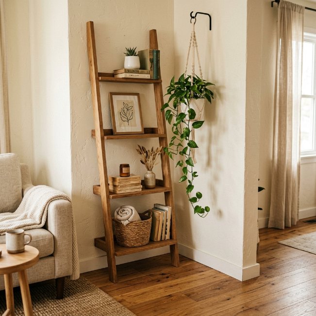
- Solves the tricky problem of oddly shaped or narrow corners
- A practical fix among empty wall decor ideas for living room corners
- Combines height, texture, and greenery in one small footprint
- Turns overlooked space into a functional, styled feature
- Works even in tight apartments with limited wall options
Corners often get skipped entirely when decorating, left bare simply because they feel too awkward to style. A leaning ladder shelf changes that instantly, adding height and function without requiring a full wall. Layering in one small framed print and a trailing plant hung slightly above fills the vertical space naturally, drawing the eye upward instead of leaving it stuck on empty air. This approach works particularly well in apartments or smaller living rooms where every wall matters and none can be left unused for long.
I’ve noticed corners are usually the last place people think to decorate, yet they often have the most unused potential in the entire room. A tall, narrow piece of furniture paired with layered decor above it turns a dead zone into one of the room’s more interesting features. This idea works especially well when the rest of the room keeps a simpler palette, letting the corner’s height and texture stand out as a deliberate design choice rather than an afterthought.
Modern Line Art Set
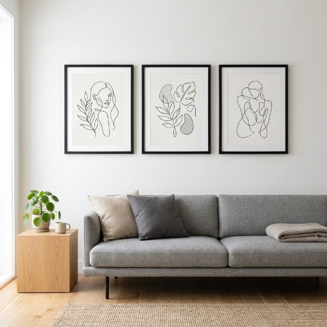
- Adds a graphic, modern touch without heavy color or pattern
- A clean fit for wall decor ideas for living room modern spaces
- Matching frames create a structured, cohesive appearance
- Simple to source and budget-friendly compared to original art
- Suits sofas and console tables that need a light visual anchor
A set of matching line-art prints offers structure and modern polish without demanding a large budget or bold color commitment. Three identical frames, evenly spaced in a horizontal row, create a graphic rhythm that feels current and intentional above a low sofa or console. Because the prints share the same frame style and spacing, the arrangement reads as cohesive even in a room that’s still developing its overall style. This idea suits contemporary and modern spaces especially well, where clean lines throughout the room echo the simplicity of the art itself.
In my experience, this set-based approach works best when the prints share a common thread, whether that’s a single color accent, a consistent line weight, or a shared subject like abstract shapes or botanical outlines. Random, unrelated prints hung in a row tend to look disjointed rather than curated. Keeping spacing equal between each frame, typically 2 to 3 inches, and centering the group above the furniture below ties the whole arrangement together into one clean, modern statement.
Conclusion:
A living room wall doesn’t have to stay empty or feel unfinished. With so many wall decor ideas for living room spaces to choose from, there’s an option here for every style, budget, and skill level, whether you’re drawn to a gallery wall, an oversized canvas, or a simple leaning frame. I’ve seen how small changes like these can completely transform how a room feels, often in just an afternoon. Pick one idea that speaks to you and give it a try this weekend. Save this post to Pinterest for later, and share it with a friend who’s staring at their own blank wall too.